Brand
Client
Merseyside Youth Association
Duration
6 Months
Website
https://mya.org.uk/
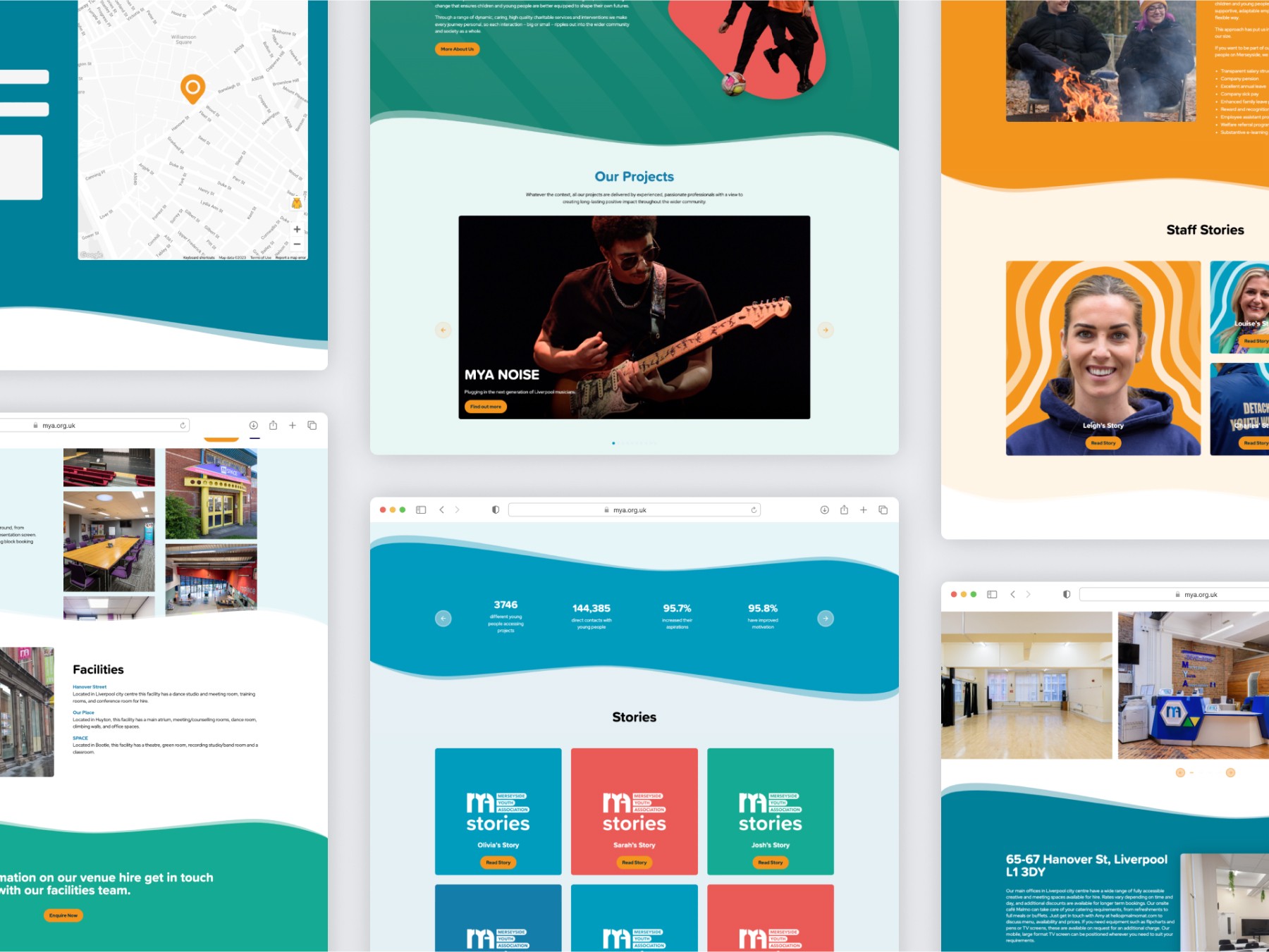
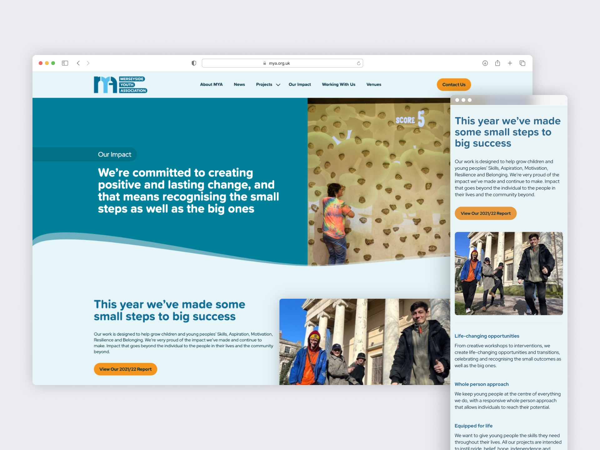
Reimagining the legacy of Merseyside Youth Association, we crafted a fresh brand identity to reflect over 130 years of impact in Liverpool’s vibrant social history. Through collaborative workshops, we defined brand pillars and developed a cohesive narrative that celebrates MYA’s ripple effect of change, from empowering young individuals to strengthening entire communities. This was brought to life with an adaptable design system, warm colours, and approachable typography, creating a brand that truly embodies MYA’s transformative work.
Background
Merseyside Youth Association has a long and extraordinary history, dating all the way back to 1890. Grounded in the incredible social history of Liverpool, our affiliated clubs and their predecessors have been helping young people cope with all kinds of challenges.
We worked with MYA to define and articulate a new brand identity, written and visual, to enable them to express their incredible narrative and the impact they deliver for people across Merseyside.

Defining the brand pillars
Using a robust, collaborative approach with the MYA team, we initially explored what MYA means to its passionate workforce, the difference it makes to its many stakeholders and what the future holds for the organisation. This gave us a base from which we were able to develop some early creative territories and brand ‘pillars’ for the brand to explore, which were then shared back with the MYA team to test, challenge and refine through collaborative working sessions.
With the building blocks in place we then moved into the development of a full brand narrative which will act as the spine for future written brand communications – providing a consistent and coherent framework for delivering the many powerful stories that MYA has from its wonderful work with young people and children across the region.

Bringing a brand to life
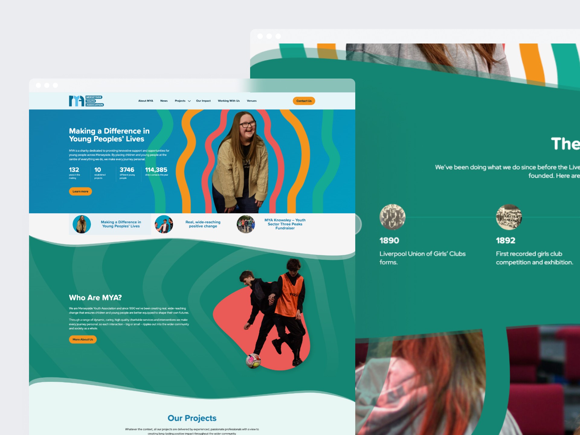
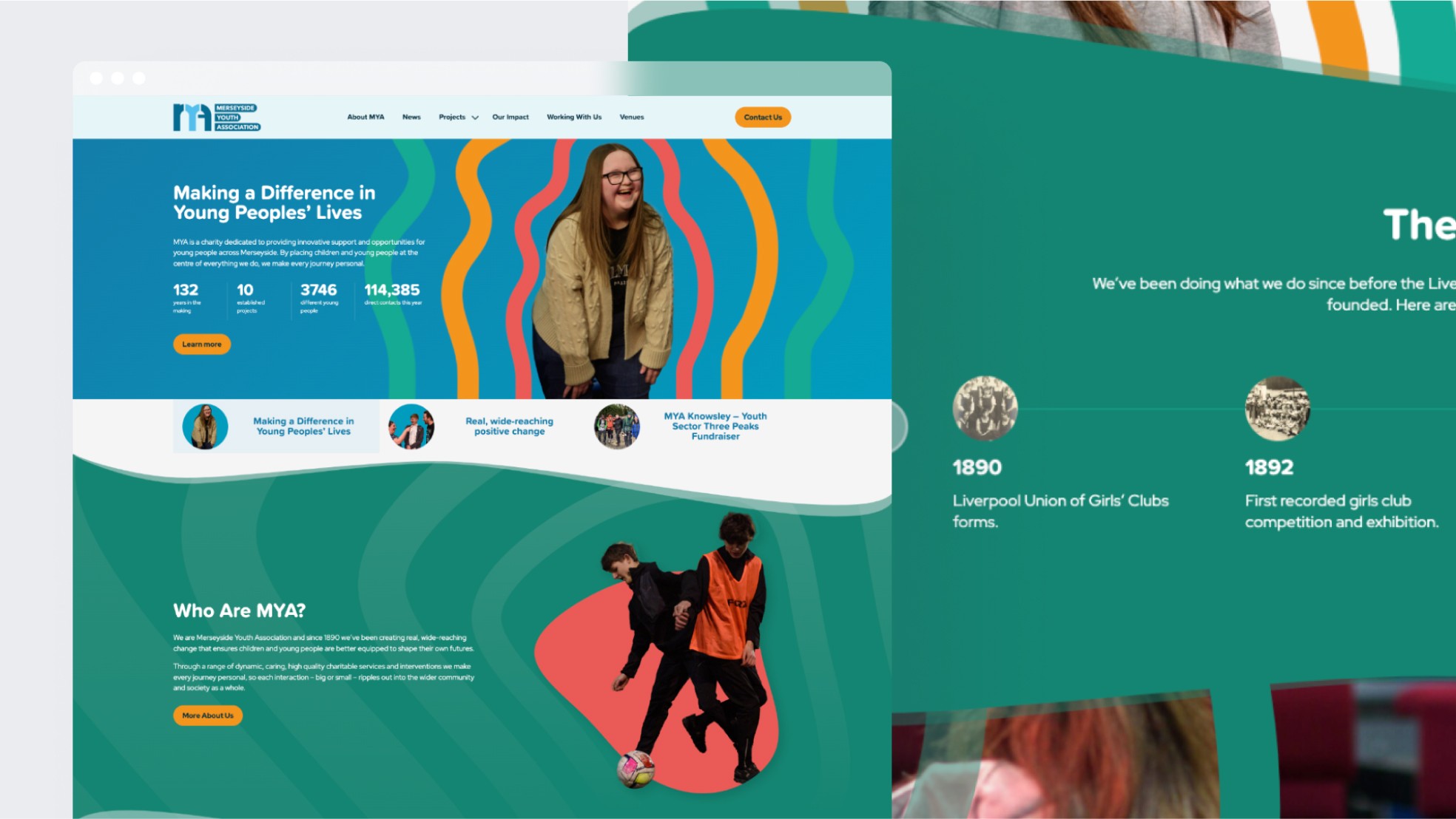
The written narrative was then brought to life through a fresh, new visual design style that will be used to lead brand communications in the future. Building on the notion of how MYA creates incredible impact that ripples outwards from an individual through to families, communities and beyond a design system was created to reflect this sense of growth.
Shaped around the individual, the graphic ‘ripple’ is always tailored to the young person that MYA is supporting and is used in an organic way across different channels.
A broad, warm colour palette was selected to give the brand flexibility and scalability; alongside a friendly primary font to reflect the personal, accessible nature of the MYA brand.


