Liverpool Heart and Chest Hospital (LHCH)is the largest single site specialist heart and chest hospital in the country, providing specialist services in cardiothoracic surgery, cardiology, respiratory medicine including adult cystic fibrosis and diagnostic imaging
Why LHCH matters to us
Heart and lung disease continue to be amongst the biggest killers in the UK. LHCH serves communities that are marked by increased prevalence of cardiovascular disease, higher levels of heart failure, hypertension, coronary artery disease and an ageing population.
Multiple public-facing campaigns on priorities linked to heart health
Digital engagement tools
Carmel College is a leading sixth form college based in Merseyside.
Why Carmel College matters to us
Carmel College is committed to developing a community where personal qualities are highly valued and where each student is enabled to reach their potential feeling supported, safe and happy during their time here.
As we continue to reflect on our 35 years of business, we’ve been taking a look at the brands that have led the way in this time to see what we can learn from them and identify what enables a brand to transcend time. And there aren’t many bigger brands out there than Nike who remain as influential now as they ever have been, with their ‘Just Do It’ proposition playing a huge role in their success. And it just so happens that ‘Just Do It’ was first used on an ad in 1988 – the year Kaleidoscope was formed! So in this blog we’ve explored the journey of the proposition from its launch 35 years ago to its enduring relevance today.
In 1988, Nike revolutionised the world of advertising and branding with its iconic proposition, “Just Do It.” Since its inception, this powerful slogan has grown from a mere marketing campaign into a global phenomenon that transcends generations. Over the years, Nike’s ‘Just Do It’ proposition has evolved, adapting to changing consumer behaviours, societal norms, and technological advancements. In this blog, we will explore the journey of ‘Just Do It’ from its launch in 1988 to its enduring relevance in 2023.
The Birth of ‘Just Do It’
In the late 1980s, Nike faced stiff competition in the athletic footwear market. To counter this, the company teamed up with advertising agency Wieden+Kennedy, which created the unforgettable ‘Just Do It’ tagline. The phrase encapsulated the essence of the brand: an empowering call to action, urging athletes to push their limits and overcome challenges. Initially launched alongside a simple TV ad featuring an 80 year old runner, and then used on bigger profile, captivating television commercial featuring various athletes, the slogan resonated strongly with consumers, propelling Nike to new heights.
Adapting to Social and Cultural Shifts
As years passed, Nike recognized the importance of staying relevant in an ever-changing world. The brand continuously evolved ‘Just Do It’ to align with contemporary social and cultural narratives. During the 1990s, the slogan took on a more inclusive tone, encouraging individuals from all walks of life to pursue their dreams fearlessly. This shift reflected the growing emphasis on diversity and empowerment, resonating with a broader audience and cementing Nike’s status as a socially conscious brand.
Embracing Technology and Digital Transformation
With the rise of the digital era, Nike embraced technology as a means of connecting with its consumers. ‘Just Do It’ found new life in digital campaigns, engaging users through social media platforms, interactive websites, and personalised content. By leveraging user-generated content and incorporating cutting-edge technologies like augmented reality, Nike strengthened its bond with tech-savvy consumers while keeping the message of determination and perseverance intact.
Partnerships and Collaborations
Another pivotal factor contributing to the longevity of ‘Just Do It’ is Nike’s strategic collaborations with athletes, artists, and influencers. By associating the proposition with notable figures who embody the spirit of pushing boundaries, Nike expanded its reach and influence. These partnerships not only generated buzz but also inspired people worldwide to chase their dreams relentlessly, further reinforcing the message behind ‘Just Do It.’
Addressing Contemporary Issues
As societal concerns such as climate change and mental health gained prominence, Nike adapted its proposition to address these issues. By advocating sustainable practices and supporting mental health initiatives, the brand demonstrated its commitment to making a positive impact on both individuals and the planet. ‘Just Do It’ became not just an encouragement for personal achievements but also a call for collective responsibility and positive change.
The Timeless Essence of ‘Just Do It’ in 2023
Despite over three decades passing since its inception, the ‘Just Do It’ proposition remains just as relevant in 2023. The key to its enduring power lies in its ability to remain authentic and adaptable to the ever-evolving world. Nike has consistently demonstrated its capacity to connect with consumers on a personal and emotional level, making ‘Just Do It’ more than just a slogan but a way of life.
In a fast-paced and uncertain world, where people are constantly bombarded with choices and distractions, ‘Just Do It’ provides a simple yet powerful reminder to take action, face challenges head-on, and pursue greatness. It encourages individuals to step outside their comfort zones, embrace failure as part of the journey, and persist until they achieve their goals.
Nike’s ‘Just Do It’ proposition has evolved and thrived since its inception in 1988, proving its resilience and relevance in 2023. By embracing cultural shifts, leveraging technology, forming meaningful partnerships, and addressing contemporary issues, Nike has kept the proposition fresh and meaningful to each new generation. As long as people continue to seek inspiration, motivation, and empowerment, ‘Just Do It’ will endure as an enduring symbol of determination, self-belief, and the indomitable human spirit.
Accessibility is a crucial aspect of modern, effective communication. When it comes to creating accessible content, one often overlooked factor is the choice of typeface. Selecting the right typeface can greatly enhance the readability and legibility of your message, ensuring that it reaches a wider audience. In this post, we will explore the key considerations and guidelines for choosing a typeface that promotes accessibility in your communications.
1. Prioritise Readability
The primary goal of an accessible typeface is to ensure readability for all individuals, including those with visual impairments or reading difficulties. Look to opt for typefaces that are clear, well-defined, and easily distinguishable; whilst also seeking to avoid decorative or ornate fonts that may hinder legibility, and instead, choose clean and simple designs.
2. Optimal Character Spacing
Character spacing, also known as kerning, plays a vital role in readability. Ensure that your chosen typeface has appropriate spacing between characters. Tight spacing can make it difficult to differentiate individual letters, while excessive spacing may cause words to lose their coherence. Strike a balance to maintain legibility without compromising aesthetics.
3. Consider Font Size and Weight
Font size and weight significantly impact accessibility. Choose a typeface that offers a range of sizes to accommodate different reading needs. A minimum font size of 12 points is generally recommended for body text, but larger sizes may be necessary for individuals with visual impairments. Additionally, varying font weights can help create visual hierarchy, making it easier for readers to navigate through the content.
4. Contrast and Colour
High contrast between the text and its background is crucial for legibility. Consider using dark text on a light background or vice versa; and try to avoid colour combinations with low contrast, such as light grey on white, as they can be challenging for individuals with visual impairments. Additionally, ensure that colour is not the sole means of conveying information, as colourblind individuals may have difficulty perceiving it. Supplement colour with other visual cues or text descriptions whenever possible.
5. Consider Accessibility Standards
When selecting a typeface, it’s essential to adhere to accessibility standards and guidelines. For digital content, ensure that the typeface is compatible with screen readers and responsive across different devices. Choosing a web-safe font or utilising web fonts through reliable platforms can help ensure consistent accessibility across browsers and devices.
6. Test and Gather Feedback
After finalising your typeface choice, consider whether you can conduct user testing to validate its accessibility. Ask individuals with different visual abilities and reading difficulties to provide feedback on readability and legibility. Incorporate their input and make necessary adjustments to improve the overall accessibility of your communications.
Choosing the right typeface is a crucial step in creating accessible communications. By prioritising readability, optimising character spacing, considering font size and weight, ensuring contrast and colour accessibility, following accessibility standards, and seeking feedback, you can make your content more inclusive and accessible to a diverse audience. Remember, accessible communications not only benefit individuals with disabilities but also contribute to a better user experience for everyone. So, let’s embrace the power of typefaces and create a more inclusive digital world.
A rebrand is an exciting yet challenging project that requires a great deal of bravery. Whether it’s a small update to the logo or a complete overhaul of the brand identity, a rebrand can be a make-or-break moment for an organisation. In this blog, we’ll discuss why bravery is essential in a rebrand and how it can lead to success.
Firstly, rebranding is all about change. It involves stepping outside of the comfort zone and making bold moves to refresh the brand’s identity. This is where bravery comes in, as it takes courage to break away from the familiar and take a leap of faith. But, without change, a brand can become stagnant, and customers and stakeholders may lose interest. Therefore, being brave enough to embrace change is critical to a successful rebrand.
Secondly, rebranding requires authenticity. Consumers are becoming increasingly savvy and can quickly detect inauthenticity. Therefore, it’s essential for brands to be brave and stay true to their values and beliefs when rebranding. Staying true to one’s beliefs can sometimes mean going against the norm. But being authentic is critical in creating a brand that consumers can connect with on an emotional level.
Thirdly, rebranding is all about taking risks. A rebrand is an opportunity to differentiate the brand from its competitors and make it easily identifiable. However, to stand out from the crowd, a brand needs to take risks and push boundaries. This can be unsettling and scary. But, if done right, it can lead to a unique and memorable brand identity that resonates with consumers.
Fourthly, rebranding requires a great deal of communication. The rebranding process involves communicating changes to employees, stakeholders, and customers. It’s essential to communicate the reasons behind the rebrand and the changes being made. Communicating changes can be challenging, and there may be pushback. But, being brave enough to have open and honest communication can lead to a smoother transition and a better understanding of the rebrand.
Lastly, rebranding can be a vulnerable moment for a brand. It involves putting oneself out there and exposing the brand to potential criticism. However, being vulnerable is essential in building trust and creating an emotional connection with consumers. It takes courage to be vulnerable and put oneself out there.
In conclusion, bravery is an essential component of any rebrand. It takes courage to embrace change, stay true to one’s beliefs, take risks, communicate changes, and be vulnerable. However, being brave can lead to a successful rebrand that resonates with consumers, differentiates the brand from its competitors, and builds trust and loyalty. So, if you’re considering a rebrand, remember that bravery is key to success.
MYA is a charity dedicated to providing innovative support and opportunities for young people across Merseyside.
Why MYA matters to us
Since 1890 MYA has been creating real, wide-reaching change that ensures children and young people are better equipped to shape their own futures.
Alternative Futures Group (AFG) is one of the largest not-for-profit Health and Social Care charities in the North West.
Why AFG matters to us
AFG has been changing lives, creating independence and achieving great outcomes for the brilliant people it supports for over 30 years – that is something that really matters.
Creating an explainer animation is a great way to communicate complex ideas in an engaging and easy-to-understand way. Whether you’re explaining a new product, service, or concept, an explainer animation can help you grab your audience’s attention and keep them engaged. In this post, we’ll take you through the steps involved in creating an explainer animation, from planning and storyboarding to animation and sound design.
Step 1: Planning and Scripting
The first step in creating an explainer animation is to plan out the overarching aim, messages and script. Start by identifying the key concepts you want to explain and write them down in a clear and concise way. This will help your project stay on track and ensure that your animation is focused and effective from the outset.
Once you have your key concepts in mind, start writing your script. This should be written in a tone and style that reflects the audience you want to engage. Keep in mind that your goal is to communicate complex ideas in a simple and engaging way, so use simple language and avoid jargon.
Step 2: Storyboarding
Once you have your script, the next step is to create a storyboard. A storyboard is a visual representation of your script that shows how each scene will be presented in your animation. It’s a critical step in the process because it allows you to visualise your animation and make sure that it flows smoothly from scene to scene.
To create a storyboard, start by sketching out your scenes on paper or on screen. You don’t need to be a great artist; simple stick figures and rough sketches are enough. Your storyboard should include all the key elements of each scene, such as characters and backgrounds.
Step 3: Visual Design
The next step is to create the visual design for your animation. This involves creating the characters, backgrounds, and other visual elements that will be used in your animation. This can be based on your brand identity and a suite of existing assets, or you may want to develop something from scratch.
When designing your visuals, keep in mind your target audience and the tone of your animation. If your target audience is young children, for example, you might want to use bright colours and simple shapes. If your animation is more serious or professional, you might want to use more muted colours and realistic designs.
Step 4: Animation
Once you have your storyboard and visuals, the next step is to create the animation itself. This involves bringing your visuals to life using animation software. There are many animation software options available, such as Adobe After Effects, Toon Boom, and Animaker.
When creating your animation, it’s important to keep your storyboard in mind and make sure that each scene flows smoothly into the next. Use sound effects and music to enhance your animation and make it more engaging.
Step 5: Sound Design
Finally, the last step is to add sound to your animation. This involves creating sound effects, a voice over and adding music to your animation. Sound effects can help enhance the visuals and make your animation more engaging, while music can help set the tone and mood of your animation.
When creating your sound design, it’s important to use high-quality sound effects and music that match the tone and mood of your animation. You can find many royalty-free sound effects and music tracks online, or you can hire a sound designer to create custom sound effects, voice over and music for your animation.In conclusion, creating an explainer animation takes planning, storyboarding, visual design, animation, and sound design. By following these steps, you can create an engaging and effective explainer animation that communicates complex ideas in a simple and engaging way. With a little practice and patience, you can create explainer animations that educate, entertain, and inspire your audience.
We work with many organisations to create a wide range of animations to being their brands, projects and campaigns to life – get in touch if you’d like to explore working together on your next project.
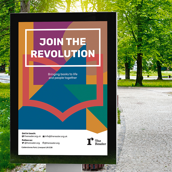
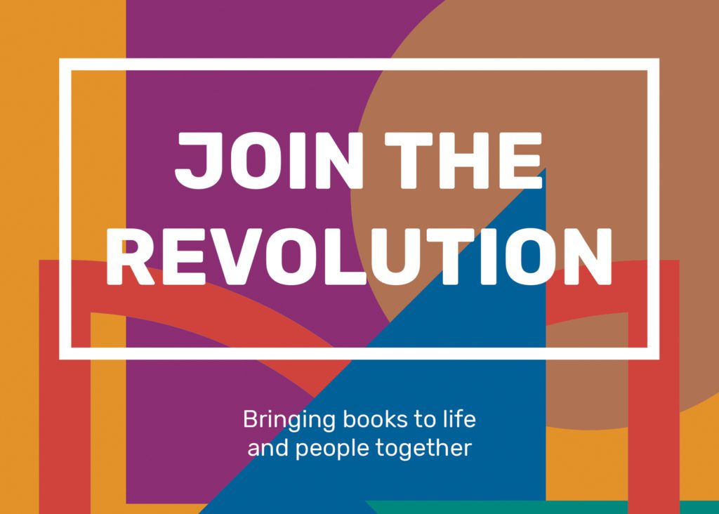
Radical and dynamic
The visual identity was developed to communicate the warmth and connection of the ‘reading revolution’ at the heart of The Reader’s work.
It aims to communicate all aspects of The Reader’s brand to reflect who they are today – a warm, radical and dynamic organisation that has literature and people at its heart.
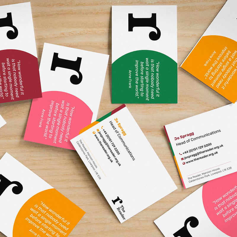
The updated identity includes a refined version of The Reader’s previous organisational logo that will help the charity to attract a more age-diverse audience as it looks to scale its reading revolution. The simplified design has been chosen to work better across digital platforms.
We also created a family of sub-brands for the visitor experiences on offer at The Reader at Calderstones. These range from The Reader Storybarn, an imaginative playspace dedicated to the delights of reading for pleasure in families, to The Reader’s social enterprises, including the Café and Ice Cream Parlour, which generate revenues to support the charity’s work with communities.
The identity was developed in a pragmatic fashion, using practical working sessions with senior leaders from The Reader to define a clear brand hierarchy and strategy, ahead of developing visual approaches and brand guidelines in a timeframe of just eight weeks.
Why it matters
The Reader believes that the unique power of literature has the potential to connect individuals, help us feel better and to rebuild lost social bonds.
It brings people together and books to life in order to make warmer, healthier, stronger communities.
This was a wonderful project to be involved with an organisation that has incredible ambitions to grow its social impact and deliver lasting impact to the communities it serves and the wider health and well-being sector.
In the health sector, it’s essential to create meaningful connections with patients and service users. So if you’re wondering how your brand can help you do that, keep reading.
At Kaleidoscope, we work with a variety of sectors, including health. From crafting communications campaigns to building unforgettabke brand messaging and activation. That’s why we feel we’re well positioned to share some advice when it comes to curating a strong and effective brand got the health sector.
Why your brand matters in healthcare
A brand isn’t just about making money; it’s about creating an impact – the right kind of impact. And in the health sector, where a brand can define a patient experience through everything from signage and uniforms to appointment reminders and patient portals — there’s no sector more important when it comes to creating a brand that understands its audience.
You need to build trust and credibility amongst patients at every turn, and to do this, you need a brand that’s easy to connect with, identify with, and, most importantly, a brand you can recognise.
So here are three key things your health brand should zero in on.
1. Focus on co-creation
It’s important you work alongside stakeholders to map out what the brand should stand for — stakeholders could be anyone from patients, service users, health professionals or regulators.
Give stakeholders the opportunity to collaboratively design a narrative and identity that is robust and evidence-based. Nothing is guessed or assumed. Instead, you’re gaining multiple perspectives from the people who matter most.
2. Establish a trusted brand with partnerships
When it comes to making a decision, whether a professional, patient or commissioner, this decision isn’t determined by just one person or one organisation alone. There are many different touchpoints, all of which play an important part in the process. The health sector is a complex one, and all these different players have value; that’s why building effective partnerships are vital to the success of your brand.
You want a trustworthy brand that has the reach and impact necessary to be successful — and partnerships are what help you achieve that.
3. Make your brand flexible
Regardless of sector, your brand needs to be flexible to change, but in a healthcare setting in particular — an industry characterised by change — your brand needs agility at its heart. Whether it’s changing systems, processes or regulations, your brand has to be ready to move quickly when opportunities arise, ensuring it remains relevant.
To achieve this, your brand has to be underpinned by a clear and comprehensive brand narrative, which provides the spine for your brand to work from.
Before you go
Making any changes to your brand, regardless of how insignificant it might seem, can impact the way your brand is perceived.
We’re experts in communication and all things branding. And just over the last few years, we’ve helped many healthcare brands reinforce their trustability through carefully crafted communications. Let us help you too — get in touch.
To provide the best experiences, we use technologies like cookies to store and/or access device information. Consenting to these technologies will allow us to process data such as browsing behavior or unique IDs on this site. Not consenting or withdrawing consent, may adversely affect certain features and functions.
Functional
Always active
The technical storage or access is strictly necessary for the legitimate purpose of enabling the use of a specific service explicitly requested by the subscriber or user, or for the sole purpose of carrying out the transmission of a communication over an electronic communications network.
Preferences
The technical storage or access is necessary for the legitimate purpose of storing preferences that are not requested by the subscriber or user.
Statistics
The technical storage or access that is used exclusively for statistical purposes.The technical storage or access that is used exclusively for anonymous statistical purposes. Without a subpoena, voluntary compliance on the part of your Internet Service Provider, or additional records from a third party, information stored or retrieved for this purpose alone cannot usually be used to identify you.
Marketing
The technical storage or access is required to create user profiles to send advertising, or to track the user on a website or across several websites for similar marketing purposes.