Accessibility is a crucial aspect of modern, effective communication. When it comes to creating accessible content, one often overlooked factor is the choice of typeface. Selecting the right typeface can greatly enhance the readability and legibility of your message, ensuring that it reaches a wider audience. In this post, we will explore the key considerations and guidelines for choosing a typeface that promotes accessibility in your communications.
1. Prioritise Readability
The primary goal of an accessible typeface is to ensure readability for all individuals, including those with visual impairments or reading difficulties. Look to opt for typefaces that are clear, well-defined, and easily distinguishable; whilst also seeking to avoid decorative or ornate fonts that may hinder legibility, and instead, choose clean and simple designs.
2. Optimal Character Spacing
Character spacing, also known as kerning, plays a vital role in readability. Ensure that your chosen typeface has appropriate spacing between characters. Tight spacing can make it difficult to differentiate individual letters, while excessive spacing may cause words to lose their coherence. Strike a balance to maintain legibility without compromising aesthetics.
3. Consider Font Size and Weight
Font size and weight significantly impact accessibility. Choose a typeface that offers a range of sizes to accommodate different reading needs. A minimum font size of 12 points is generally recommended for body text, but larger sizes may be necessary for individuals with visual impairments. Additionally, varying font weights can help create visual hierarchy, making it easier for readers to navigate through the content.
4. Contrast and Colour
High contrast between the text and its background is crucial for legibility. Consider using dark text on a light background or vice versa; and try to avoid colour combinations with low contrast, such as light grey on white, as they can be challenging for individuals with visual impairments. Additionally, ensure that colour is not the sole means of conveying information, as colourblind individuals may have difficulty perceiving it. Supplement colour with other visual cues or text descriptions whenever possible.
5. Consider Accessibility Standards
When selecting a typeface, it’s essential to adhere to accessibility standards and guidelines. For digital content, ensure that the typeface is compatible with screen readers and responsive across different devices. Choosing a web-safe font or utilising web fonts through reliable platforms can help ensure consistent accessibility across browsers and devices.
6. Test and Gather Feedback
After finalising your typeface choice, consider whether you can conduct user testing to validate its accessibility. Ask individuals with different visual abilities and reading difficulties to provide feedback on readability and legibility. Incorporate their input and make necessary adjustments to improve the overall accessibility of your communications.
Choosing the right typeface is a crucial step in creating accessible communications. By prioritising readability, optimising character spacing, considering font size and weight, ensuring contrast and colour accessibility, following accessibility standards, and seeking feedback, you can make your content more inclusive and accessible to a diverse audience. Remember, accessible communications not only benefit individuals with disabilities but also contribute to a better user experience for everyone. So, let’s embrace the power of typefaces and create a more inclusive digital world.
Many of us use interactive tools and web apps on a daily basis – whether it be webmail, online calculators or e-commerce retailers. Accessed via an internet browser, rather than a downloaded application, web apps are flexible digital tools and accessible across multiple devices.
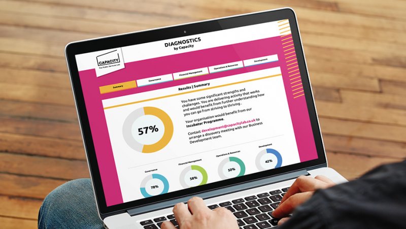
In recent months we have worked on a number of web apps for our clients that have enabled them to harness the tech and connect with their audiences in a range of ways. This includes a tool to aid the sales pipeline for a business consultancy, through which users are able to ‘diagnose’ their business challenge and therefore provide valuable insight on customer needs to the consultancy . An interactive set of questions are completed by the user in collaboration with the consultancy to drive engagement, with a personalised report automatically generated for every user that highlights the areas that they need support.
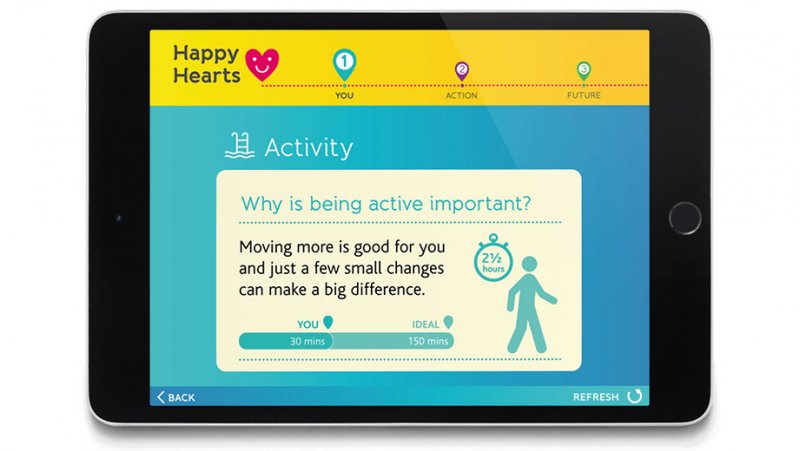
We’ve also worked on a tool to stimulate conversations around blood pressure between health professionals and the public. Based on a series of on-screen questions and utilised within face-to-face sessions with professionals, the tool encourages people to reflect on their lifestyle before they are presented with a personalised dashboard of their current ‘heart health’. High-level guidance is provided on practical steps that individuals can take to improve their health, while health professionals are able to use the dashboard to prompt further discussions about wider changes that could be made and services available locally.
If you would like to talk to us about creating a web app for you, then please get in touch!
Happy Hearts – a tool to encourage conversations around blood pressureDiagnostics – a tool to diagnose business challenges amongst prospective clients
When you think of a ‘brand’ and what it means to you, you might immediately think about logos, font, and brand colours — and all that stuff is important. But it’s not all a brand is; they’re just branding elements.
A brand is a distinctive skin you’re giving your business that extends past aesthetics. It’s what customers will identify you with — whether it’s your tone of voice, your style, your colours, your messaging — you’re building an identity that customers will come to know and love. And a brand people can relate to increases custom, according to a Nielson survey [PDF], 59% of consumers prefer to buy new products from brands familiar to them.
But branding isn’t just a one-off task, branding is a process that’s cyclical. It’s something that adapts and evolves with your business and its customers.
So, what should you consider when you’re developing a brand?
1. Identify who you’re trying to reach
Sounds basic. And it is, but it’s so obvious that it’s overlooked, or some brands think that the persona research they’ve already got on file will cut the mustard. And it might not.
The truth is, customer behaviour changes all the time — how they browse for your products and how they interact online changes. That’s why keeping your personas updated is key to a successful brand development project; what customers want today might not be the same as four or five months ago.
And building that connection with your audience is crucial. According to Sprout Social, 64% of consumers want brands to connect with them — but you can only do that if you know who your customers are, right?
2. Define where your brand sits in the marketplace
If you don’t know how you stack up to competitors, you’re not going to have the opportunity to create a different brand. There are plenty of tools out there to help you understand the market you’re competing in. You might already have a fair idea of what the competition looks like, but analysing the competition can help you reframe your own understanding of your product and where it sits in the marketplace.
Tools like SEMrush can help you determine the niche market players, the market leaders, and the biggest competitors you’ve got. You need to know what’s currently out there and how your service or product stacks up to theirs. Is there a gap in the market? If there is, SEMrush or tools like it will help you find it (or Kaleidoscope, ideally. But hey, some people are on tight budgets!).
3. Think about your messaging strategy
Your brand messaging is what ties all your branding elements neatly together. It’s what will resonate with your customers — it’s what you want them to remember about your brand. Without clear brand messaging, you’re not effectively communicating why people should care about you and showcasing the value you offer them.
So, where do you start when creating your brand messaging? It’s helpful to lay out some guidelines so the messaging is structured and well-rounded. Your brand messaging framework would usually include:
your USP
your values (think about your customers’ values, too, so they’re aligned)
a mission statement
a defined tone of voice
your audience personas
Need a bit of guidance? Call us to see how we can help: 0151 707 2220.
Before you go, here’s a branding mistake we see again and again
Bringing too much personal emotion into the branding process is a mistake. You need to be objective, not subjective, when it comes to branding. We need to connect with your intended audience, and we can’t do that if your personal likes and dislikes creep on in there.
Stay focused. Your audience should take priority; they’re the ones you want to familiarise your new brand with. Let’s build that intimate emotional connection.
Champs is a long-standing collaborative of nine Directors of Public Health and their teams serving 2.5 million people in C&M, who also have a strategic influencing role within the Liverpool City Region combined authority and the Cheshire & Warrington sub-region.
Why Champs matters to us?
Champs places collaboration at the heart of its comprehensive and systematic approach to improving public health priorities by large scale action and working together as system leaders across Cheshire & Merseyside. Health issues don’t recognise boundaries and so working together is vital to the wellbeing of our communities.
LUH runs Aintree University Hospital, Broadgreen Hospital, Liverpool University Dental Hospital and the Royal Liverpool University Hospital. It serves a core population of around 630,000 people across Merseyside as well as providing a range of highly specialist services to a catchment area of more than two million people in the North West region and beyond.
Why LUH matters to us?
LUH works together to support the communities of Liverpool to live happier, healthier, fairer lives. It strives to deliver great quality care, and to be recognised for our commitment to innovation. It is proud to serve families, friends and our city, and our region.
To provide the best experiences, we use technologies like cookies to store and/or access device information. Consenting to these technologies will allow us to process data such as browsing behavior or unique IDs on this site. Not consenting or withdrawing consent, may adversely affect certain features and functions.
Functional
Always active
The technical storage or access is strictly necessary for the legitimate purpose of enabling the use of a specific service explicitly requested by the subscriber or user, or for the sole purpose of carrying out the transmission of a communication over an electronic communications network.
Preferences
The technical storage or access is necessary for the legitimate purpose of storing preferences that are not requested by the subscriber or user.
Statistics
The technical storage or access that is used exclusively for statistical purposes.The technical storage or access that is used exclusively for anonymous statistical purposes. Without a subpoena, voluntary compliance on the part of your Internet Service Provider, or additional records from a third party, information stored or retrieved for this purpose alone cannot usually be used to identify you.
Marketing
The technical storage or access is required to create user profiles to send advertising, or to track the user on a website or across several websites for similar marketing purposes.