Liverpool Heart and Chest Hospital (LHCH)is the largest single site specialist heart and chest hospital in the country, providing specialist services in cardiothoracic surgery, cardiology, respiratory medicine including adult cystic fibrosis and diagnostic imaging
Why LHCH matters to us
Heart and lung disease continue to be amongst the biggest killers in the UK. LHCH serves communities that are marked by increased prevalence of cardiovascular disease, higher levels of heart failure, hypertension, coronary artery disease and an ageing population.
Multiple public-facing campaigns on priorities linked to heart health
Digital engagement tools
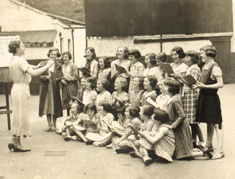
Carmel College is a leading sixth form college based in Merseyside.
Why Carmel College matters to us
Carmel College is committed to developing a community where personal qualities are highly valued and where each student is enabled to reach their potential feeling supported, safe and happy during their time here.
We’ve been in Liverpool for a while, 35 years in fact, so we thought we’d create a suite of illustrations of iconic features of the city (with a birthday twist) and give them away…for FREE!
We’ll be making them available online soon but if you’d like to get a set before then drop us a message or give us a call!
As we continue to reflect on our 35 years of business, we’ve been taking a look at the brands that have led the way in this time to see what we can learn from them and identify what enables a brand to transcend time. And there aren’t many bigger brands out there than Nike who remain as influential now as they ever have been, with their ‘Just Do It’ proposition playing a huge role in their success. And it just so happens that ‘Just Do It’ was first used on an ad in 1988 – the year Kaleidoscope was formed! So in this blog we’ve explored the journey of the proposition from its launch 35 years ago to its enduring relevance today.
In 1988, Nike revolutionised the world of advertising and branding with its iconic proposition, “Just Do It.” Since its inception, this powerful slogan has grown from a mere marketing campaign into a global phenomenon that transcends generations. Over the years, Nike’s ‘Just Do It’ proposition has evolved, adapting to changing consumer behaviours, societal norms, and technological advancements. In this blog, we will explore the journey of ‘Just Do It’ from its launch in 1988 to its enduring relevance in 2023.
The Birth of ‘Just Do It’
In the late 1980s, Nike faced stiff competition in the athletic footwear market. To counter this, the company teamed up with advertising agency Wieden+Kennedy, which created the unforgettable ‘Just Do It’ tagline. The phrase encapsulated the essence of the brand: an empowering call to action, urging athletes to push their limits and overcome challenges. Initially launched alongside a simple TV ad featuring an 80 year old runner, and then used on bigger profile, captivating television commercial featuring various athletes, the slogan resonated strongly with consumers, propelling Nike to new heights.
Adapting to Social and Cultural Shifts
As years passed, Nike recognized the importance of staying relevant in an ever-changing world. The brand continuously evolved ‘Just Do It’ to align with contemporary social and cultural narratives. During the 1990s, the slogan took on a more inclusive tone, encouraging individuals from all walks of life to pursue their dreams fearlessly. This shift reflected the growing emphasis on diversity and empowerment, resonating with a broader audience and cementing Nike’s status as a socially conscious brand.
Embracing Technology and Digital Transformation
With the rise of the digital era, Nike embraced technology as a means of connecting with its consumers. ‘Just Do It’ found new life in digital campaigns, engaging users through social media platforms, interactive websites, and personalised content. By leveraging user-generated content and incorporating cutting-edge technologies like augmented reality, Nike strengthened its bond with tech-savvy consumers while keeping the message of determination and perseverance intact.
Partnerships and Collaborations
Another pivotal factor contributing to the longevity of ‘Just Do It’ is Nike’s strategic collaborations with athletes, artists, and influencers. By associating the proposition with notable figures who embody the spirit of pushing boundaries, Nike expanded its reach and influence. These partnerships not only generated buzz but also inspired people worldwide to chase their dreams relentlessly, further reinforcing the message behind ‘Just Do It.’
Addressing Contemporary Issues
As societal concerns such as climate change and mental health gained prominence, Nike adapted its proposition to address these issues. By advocating sustainable practices and supporting mental health initiatives, the brand demonstrated its commitment to making a positive impact on both individuals and the planet. ‘Just Do It’ became not just an encouragement for personal achievements but also a call for collective responsibility and positive change.
The Timeless Essence of ‘Just Do It’ in 2023
Despite over three decades passing since its inception, the ‘Just Do It’ proposition remains just as relevant in 2023. The key to its enduring power lies in its ability to remain authentic and adaptable to the ever-evolving world. Nike has consistently demonstrated its capacity to connect with consumers on a personal and emotional level, making ‘Just Do It’ more than just a slogan but a way of life.
In a fast-paced and uncertain world, where people are constantly bombarded with choices and distractions, ‘Just Do It’ provides a simple yet powerful reminder to take action, face challenges head-on, and pursue greatness. It encourages individuals to step outside their comfort zones, embrace failure as part of the journey, and persist until they achieve their goals.
Nike’s ‘Just Do It’ proposition has evolved and thrived since its inception in 1988, proving its resilience and relevance in 2023. By embracing cultural shifts, leveraging technology, forming meaningful partnerships, and addressing contemporary issues, Nike has kept the proposition fresh and meaningful to each new generation. As long as people continue to seek inspiration, motivation, and empowerment, ‘Just Do It’ will endure as an enduring symbol of determination, self-belief, and the indomitable human spirit.
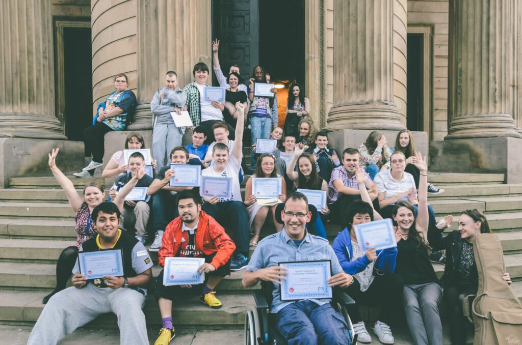
Background
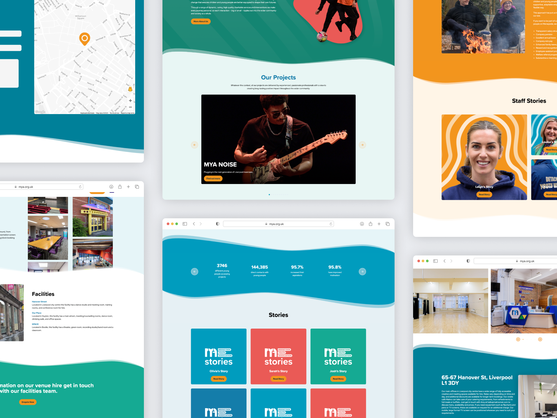
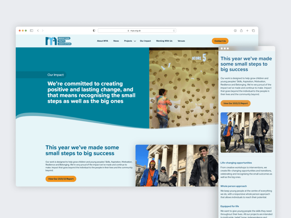
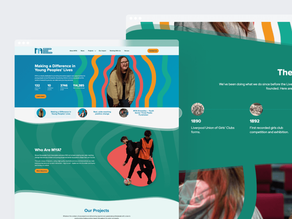
Merseyside Youth Association has a long and extraordinary history, dating all the way back to 1890. Grounded in the incredible social history of Liverpool, our affiliated clubs and their predecessors have been helping young people cope with all kinds of challenges.
We worked with MYA to define and articulate a new brand identity, written and visual, to enable them to express their incredible narrative and the impact they deliver for people across Merseyside.
Defining the brand pillars
Using a robust, collaborative approach with the MYA team, we initially explored what MYA means to its passionate workforce, the difference it makes to its many stakeholders and what the future holds for the organisation. This gave us a base from which we were able to develop some early creative territories and brand ‘pillars’ for the brand to explore, which were then shared back with the MYA team to test, challenge and refine through collaborative working sessions.
With the building blocks in place we then moved into the development of a full brand narrative which will act as the spine for future written brand communications – providing a consistent and coherent framework for delivering the many powerful stories that MYA has from its wonderful work with young people and children across the region.
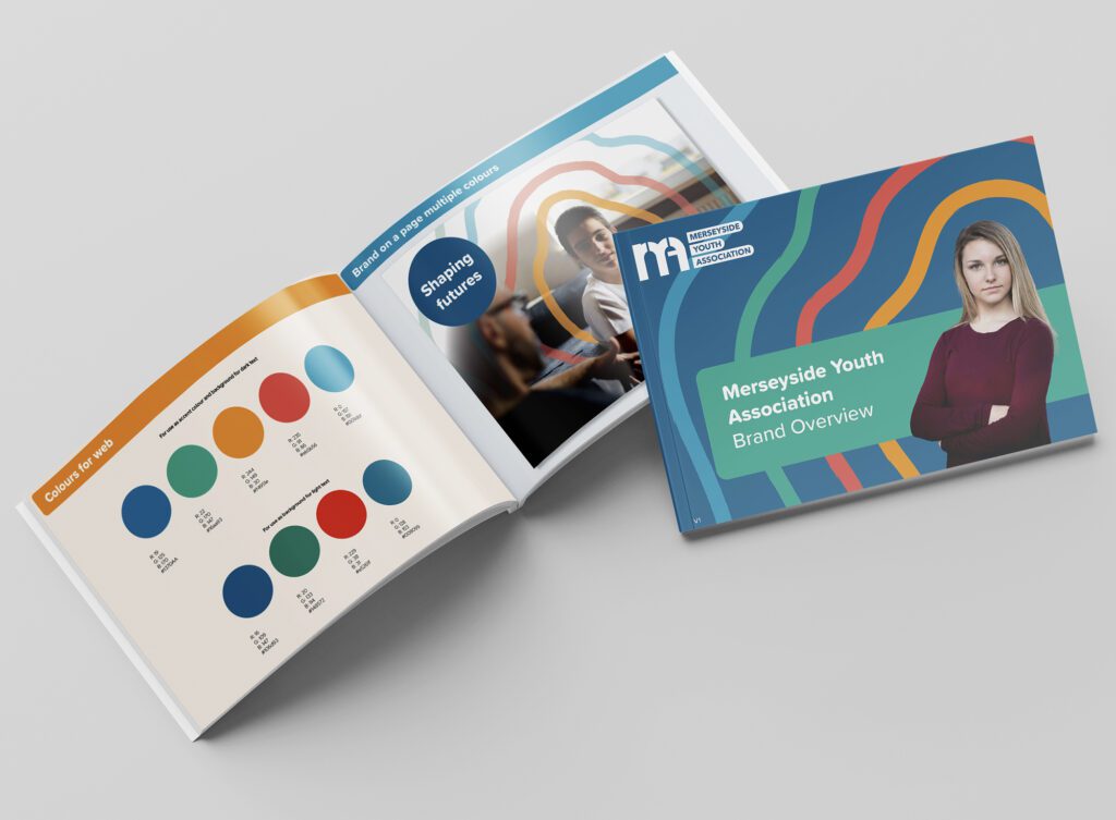
Bringing a brand to life
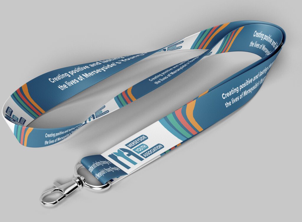
The written narrative was then brought to life through a fresh, new visual design style that will be used to lead brand communications in the future. Building on the notion of how MYA creates incredible impact that ripples outwards from an individual through to families, communities and beyond a design system was created to reflect this sense of growth.
Shaped around the individual, the graphic ‘ripple’ is always tailored to the young person that MYA is supporting and is used in an organic way across different channels.
A broad, warm colour palette was selected to give the brand flexibility and scalability; alongside a friendly primary font to reflect the personal, accessible nature of the MYA brand.
Background
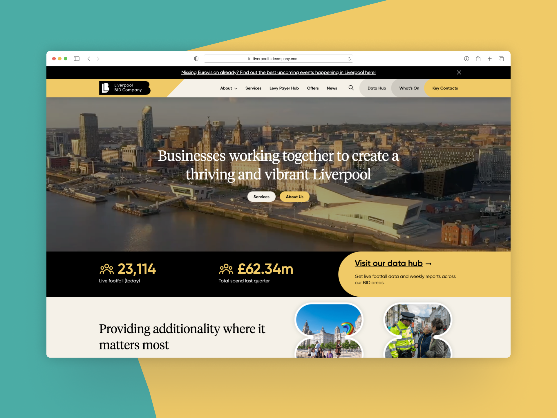
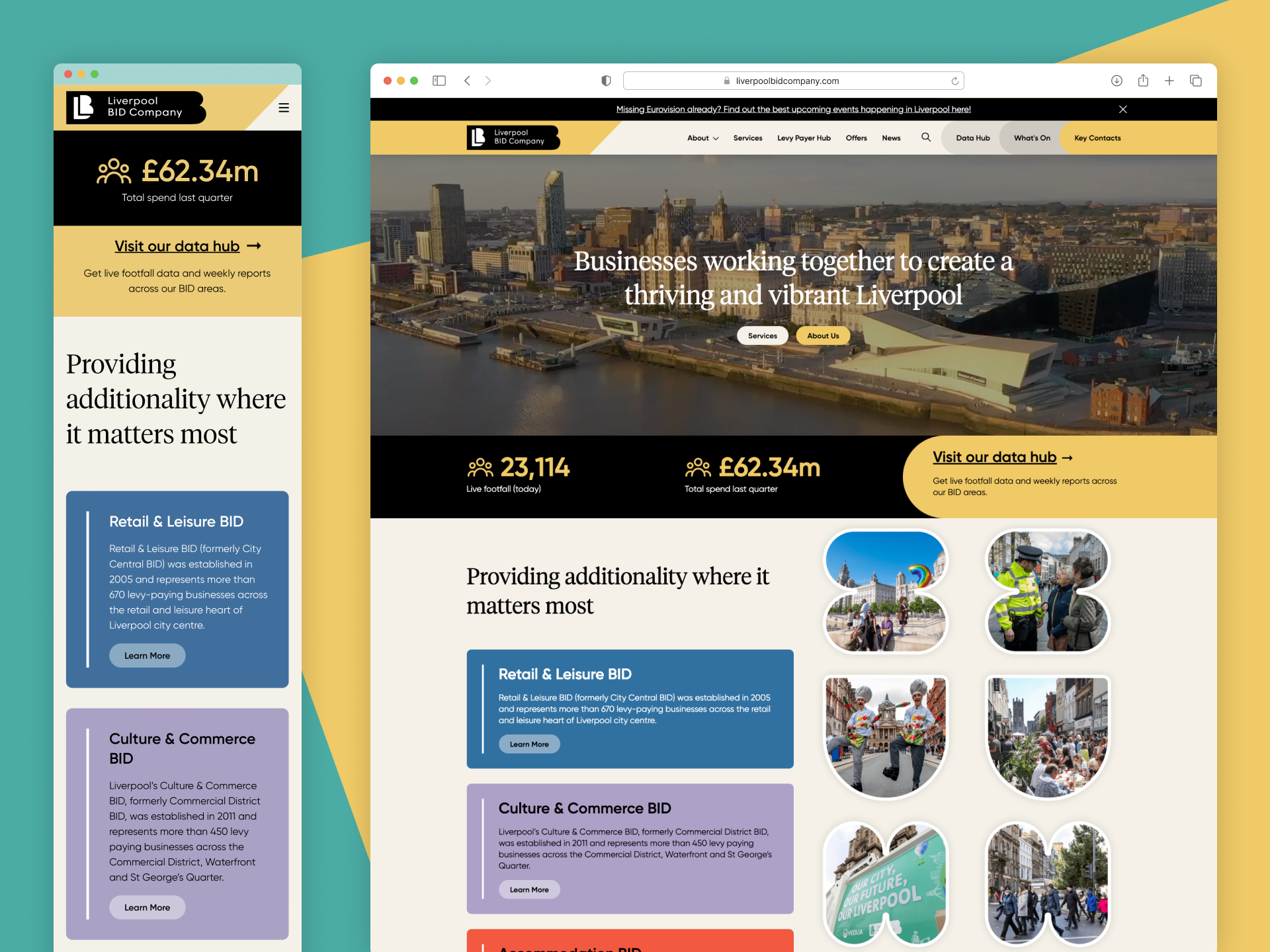
Liverpool BID Company is a private not-for-profit company that has a fantastic reputation across the city as a champion of local business, and a track record that has seen improvements across the city’s varied business districts. They work on behalf of their many levy payers to improve the city and its businesses making Liverpool an amazing place to live, work and visit.
Established in 2005, their years of dedication to the city and it’s levy payers have seen the Liverpool BID Company experience sustained growth and increased exposure leading them to be in a position to re-invest into getting a new website that focuses on the user experience, making the website user friendly and easy to navigate for its BID levy payers and other stakeholders.
What was the opportunity?
Liverpool BID Company identified that their current website could benefit from a refresh that puts user experience at the forefront. The core objective of the project was to create a new user-friendly website that provides their varied audience groups with a fast, reliable, and easy-to-use hub for information about, and from, Liverpool BID Company.
We worked with the BID team to develop the new platform, which included a new user-friendly navigation, a revised structure, updated layout, new look and feel, and improved interface to help create a strong new user experience.
The new site required an easy to manage backend content management system (CMS) that will help the team at Liverpool BID Company add information/data to the site quickly and easily; and a clear simple navigation of information for stakeholders in the front end structure and layout. This along with other success factors such as accessibility, high quality user experience, SEO and page speed were to be considered as the key criteria of this project.
Why it matters
Liverpool BID Company brings additionality to the people of Liverpool through street transformation, connectivity and collaboration which ultimately enhances our community. They are passionate about what they do, and as a local business in Liverpool our community is always at the forefront of what we do.
We here at Kaleidoscope value communications that matter and we believe that the work that Liverpool BID Company does for our community is highly important to the people and businesses of Liverpool. Therefore we have been thrilled to be a part of implementing a high quality user focused online platform to enable them to continue to provide the highest quality of service to the people of Liverpool.
What did we do?
At the outset of the project we initiated an in-depth strategy and planning phase. Collaborating closely with the Liverpool BID Company team, we facilitated workshops to explore the organisation’s needs, the target audience and competitors. By aligning business goals with user needs, we were able to devise an approach and roadmap that included a detailed timeline, budget and resource allocation, in addition to a detailed scope of the project to ensure transparent and efficient workflow.
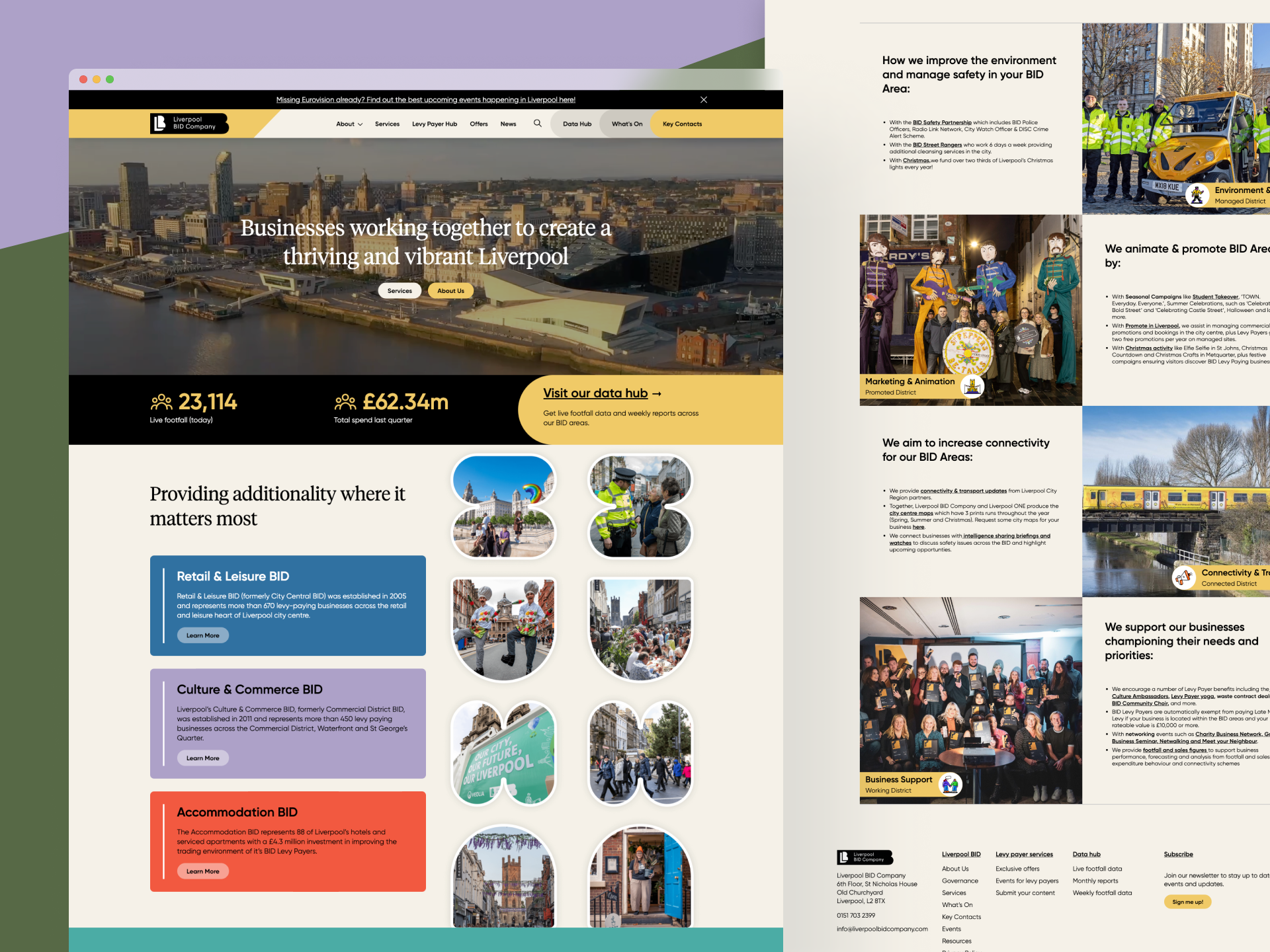
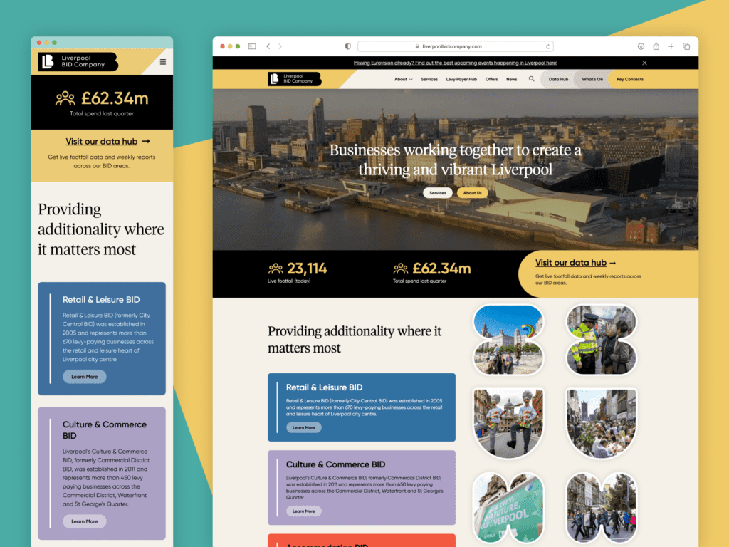
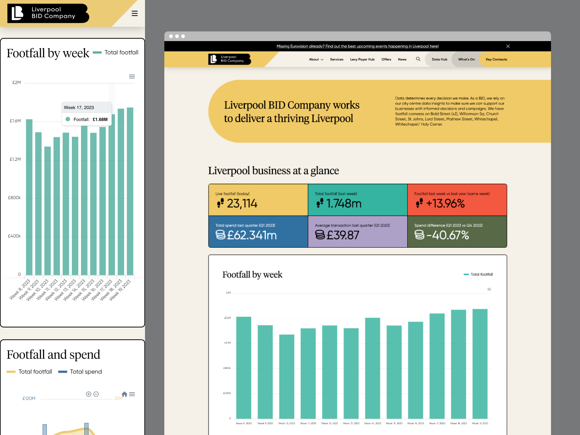
The key features of the site showcase a new and interactive events calendar with the ability to categorise events using a filter, a comprehensive data hub consisting of live footfall and consumer spending data, and a unique levy payer hub which allows users to find exactly what they are looking for quickly and easily when browsing the site.
The events calendar provides the functionality of adding upcoming events that the Liverpool BID Company are involved with and also to categorise each event into a specific type of event, location or occasion. For example whilst the Eurovision song contest was running throughout Liverpool each event could easily be found by going to the “What’s On” page and then navigating through the filters to the Eurovision category where all events relating to the contest could be found. The Calendar also features different layouts including List view and Calendar Month view.
The Data Hub section features a custom built API integration, as part of a bespoke WordPress plugin, which takes in datasets from footfall and consumer spending data services, runs a range of localised calculations to produce relevant Liverpool focused statistics, trends and charts, and then displays them to site users. This includes hourly updated live (hourly) data, monthly summaries and quarter-by-quarter trend analysis.
The unique levy payer sections allows members to quickly access Events, Offers and News specified to members only. This gives an easy route through the site for levy payers as once they have arrived at this page everything they will specifically need can be found throughout the page.
User experience (UX) design played a crucial role in the website’s development, and considerable attention was dedicated to this aspect in the planning phase and throughout. Employing a user-centric approach to the sitemap, architecture and design, the resulting website was thoughtfully crafted to provide a clear, simple and visually appealing experience for visitors. Our design team meticulously considered information such as architecture, navigation, and visual hierarchy to optimise user flow and engagement. As well as incorporating responsive design principles, ensuring seamless access and usability across various devices and screen sizes.
Before the launch of the site, we implemented a comprehensive quality assurance strategy encompassing browser testing, responsive testing, performance testing, and accessibility testing. By adhering to robust testing practices such as this, we ensure a high standard of quality and reliability for all of the websites we build.
Accessibility is a crucial aspect of modern, effective communication. When it comes to creating accessible content, one often overlooked factor is the choice of typeface. Selecting the right typeface can greatly enhance the readability and legibility of your message, ensuring that it reaches a wider audience. In this post, we will explore the key considerations and guidelines for choosing a typeface that promotes accessibility in your communications.
1. Prioritise Readability
The primary goal of an accessible typeface is to ensure readability for all individuals, including those with visual impairments or reading difficulties. Look to opt for typefaces that are clear, well-defined, and easily distinguishable; whilst also seeking to avoid decorative or ornate fonts that may hinder legibility, and instead, choose clean and simple designs.
2. Optimal Character Spacing
Character spacing, also known as kerning, plays a vital role in readability. Ensure that your chosen typeface has appropriate spacing between characters. Tight spacing can make it difficult to differentiate individual letters, while excessive spacing may cause words to lose their coherence. Strike a balance to maintain legibility without compromising aesthetics.
3. Consider Font Size and Weight
Font size and weight significantly impact accessibility. Choose a typeface that offers a range of sizes to accommodate different reading needs. A minimum font size of 12 points is generally recommended for body text, but larger sizes may be necessary for individuals with visual impairments. Additionally, varying font weights can help create visual hierarchy, making it easier for readers to navigate through the content.
4. Contrast and Colour
High contrast between the text and its background is crucial for legibility. Consider using dark text on a light background or vice versa; and try to avoid colour combinations with low contrast, such as light grey on white, as they can be challenging for individuals with visual impairments. Additionally, ensure that colour is not the sole means of conveying information, as colourblind individuals may have difficulty perceiving it. Supplement colour with other visual cues or text descriptions whenever possible.
5. Consider Accessibility Standards
When selecting a typeface, it’s essential to adhere to accessibility standards and guidelines. For digital content, ensure that the typeface is compatible with screen readers and responsive across different devices. Choosing a web-safe font or utilising web fonts through reliable platforms can help ensure consistent accessibility across browsers and devices.
6. Test and Gather Feedback
After finalising your typeface choice, consider whether you can conduct user testing to validate its accessibility. Ask individuals with different visual abilities and reading difficulties to provide feedback on readability and legibility. Incorporate their input and make necessary adjustments to improve the overall accessibility of your communications.
Choosing the right typeface is a crucial step in creating accessible communications. By prioritising readability, optimising character spacing, considering font size and weight, ensuring contrast and colour accessibility, following accessibility standards, and seeking feedback, you can make your content more inclusive and accessible to a diverse audience. Remember, accessible communications not only benefit individuals with disabilities but also contribute to a better user experience for everyone. So, let’s embrace the power of typefaces and create a more inclusive digital world.
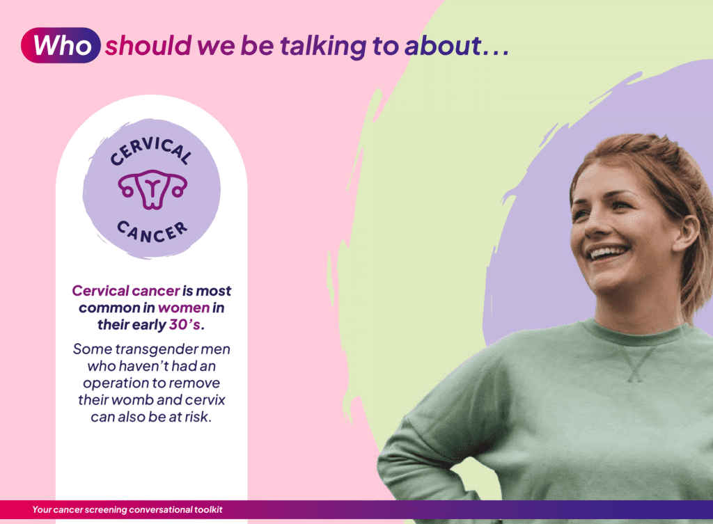
What was the challenge?
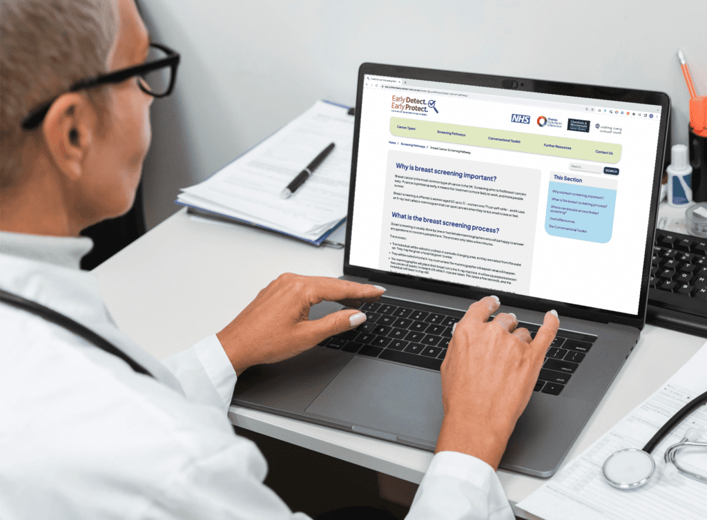
Champs wanted to help support healthcare and community professionals in starting conversations about screening for breast, bowel and cervical cancers with people living in Cheshire and Merseyside.
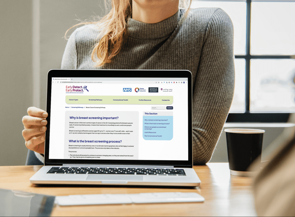
They commissioned Kaleidoscope to help build an informative website platform and communications toolkit, with an overarching aim to educate and empower everyone from GPs to community nurses, community professionals and volunteers so they can start more early conversations about screening with the people they see every day.
Working closely with Champs, we reviewed their plan for the promotion of cancer screening and how a website and communication toolkit could support this ambition. As a result, we developed a new digital platform that provides professionals with all the information they may need to promote and talk about cancer screening within community settings.
The development of the platform initially focused on the creation of a new name ‘Early Detect, Early Protect’ and an accompanying look/feel which was tested amongst a representative sample of the target audience to ensure relevance and credibility.
Using an extensive research base, we then established a user journey for the platform that would define the content structure and flow, and provided the framework for us to move ahead into full design and development.
The platform consists of a number of areas of key content including information on different cancer types and different screening pathways to demystify what screening is and the steps involved.
This is supported by a resource toolkit, including a suite of posters and social media posts, that professionals can download and use to promote cancer screening within their communities. In addition a resource section displays a collection of relevant resources in an archive which users can filter using a number of categories.
Why it matters
400 users in first four weeks of launch
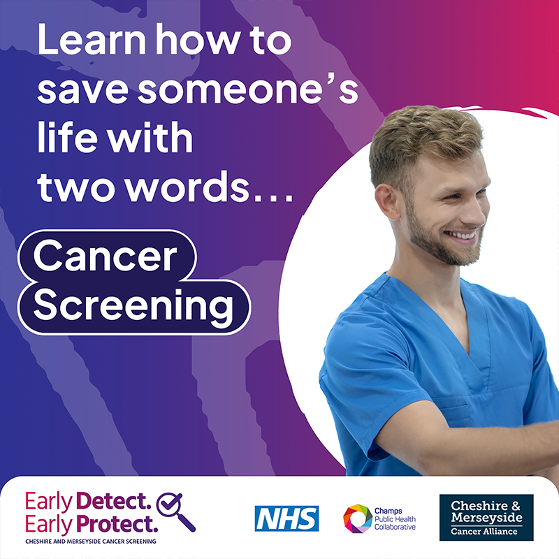
Catching cancer early saves lives. If we can detect it and start treatment early, it’s more likely to work – and more people will survive.
A rebrand is an exciting yet challenging project that requires a great deal of bravery. Whether it’s a small update to the logo or a complete overhaul of the brand identity, a rebrand can be a make-or-break moment for an organisation. In this blog, we’ll discuss why bravery is essential in a rebrand and how it can lead to success.
Firstly, rebranding is all about change. It involves stepping outside of the comfort zone and making bold moves to refresh the brand’s identity. This is where bravery comes in, as it takes courage to break away from the familiar and take a leap of faith. But, without change, a brand can become stagnant, and customers and stakeholders may lose interest. Therefore, being brave enough to embrace change is critical to a successful rebrand.
Secondly, rebranding requires authenticity. Consumers are becoming increasingly savvy and can quickly detect inauthenticity. Therefore, it’s essential for brands to be brave and stay true to their values and beliefs when rebranding. Staying true to one’s beliefs can sometimes mean going against the norm. But being authentic is critical in creating a brand that consumers can connect with on an emotional level.
Thirdly, rebranding is all about taking risks. A rebrand is an opportunity to differentiate the brand from its competitors and make it easily identifiable. However, to stand out from the crowd, a brand needs to take risks and push boundaries. This can be unsettling and scary. But, if done right, it can lead to a unique and memorable brand identity that resonates with consumers.
Fourthly, rebranding requires a great deal of communication. The rebranding process involves communicating changes to employees, stakeholders, and customers. It’s essential to communicate the reasons behind the rebrand and the changes being made. Communicating changes can be challenging, and there may be pushback. But, being brave enough to have open and honest communication can lead to a smoother transition and a better understanding of the rebrand.
Lastly, rebranding can be a vulnerable moment for a brand. It involves putting oneself out there and exposing the brand to potential criticism. However, being vulnerable is essential in building trust and creating an emotional connection with consumers. It takes courage to be vulnerable and put oneself out there.
In conclusion, bravery is an essential component of any rebrand. It takes courage to embrace change, stay true to one’s beliefs, take risks, communicate changes, and be vulnerable. However, being brave can lead to a successful rebrand that resonates with consumers, differentiates the brand from its competitors, and builds trust and loyalty. So, if you’re considering a rebrand, remember that bravery is key to success.
Liverpool BID Company is a private, not-for-profit limited company, working on behalf of 1,000 BID Levy Payers in Liverpool.
Why Liverpool BID matters to us
BIDs are a powerful, independent voice representing the interests of a varied community of organisations, committed to working together to ensure that the area continues to progress whilst providing the best possible trading and working environment for its occupiers.
To provide the best experiences, we use technologies like cookies to store and/or access device information. Consenting to these technologies will allow us to process data such as browsing behavior or unique IDs on this site. Not consenting or withdrawing consent, may adversely affect certain features and functions.
Functional
Always active
The technical storage or access is strictly necessary for the legitimate purpose of enabling the use of a specific service explicitly requested by the subscriber or user, or for the sole purpose of carrying out the transmission of a communication over an electronic communications network.
Preferences
The technical storage or access is necessary for the legitimate purpose of storing preferences that are not requested by the subscriber or user.
Statistics
The technical storage or access that is used exclusively for statistical purposes.The technical storage or access that is used exclusively for anonymous statistical purposes. Without a subpoena, voluntary compliance on the part of your Internet Service Provider, or additional records from a third party, information stored or retrieved for this purpose alone cannot usually be used to identify you.
Marketing
The technical storage or access is required to create user profiles to send advertising, or to track the user on a website or across several websites for similar marketing purposes.