Liverpool Heart and Chest Hospital (LHCH)is the largest single site specialist heart and chest hospital in the country, providing specialist services in cardiothoracic surgery, cardiology, respiratory medicine including adult cystic fibrosis and diagnostic imaging
Why LHCH matters to us
Heart and lung disease continue to be amongst the biggest killers in the UK. LHCH serves communities that are marked by increased prevalence of cardiovascular disease, higher levels of heart failure, hypertension, coronary artery disease and an ageing population.
Multiple public-facing campaigns on priorities linked to heart health
Digital engagement tools
Carmel College is a leading sixth form college based in Merseyside.
Why Carmel College matters to us
Carmel College is committed to developing a community where personal qualities are highly valued and where each student is enabled to reach their potential feeling supported, safe and happy during their time here.
Alternative Futures Group (AFG) is one of the largest not-for-profit Health and Social Care charities in the North West.
Why AFG matters to us
AFG has been changing lives, creating independence and achieving great outcomes for the brilliant people it supports for over 30 years – that is something that really matters.
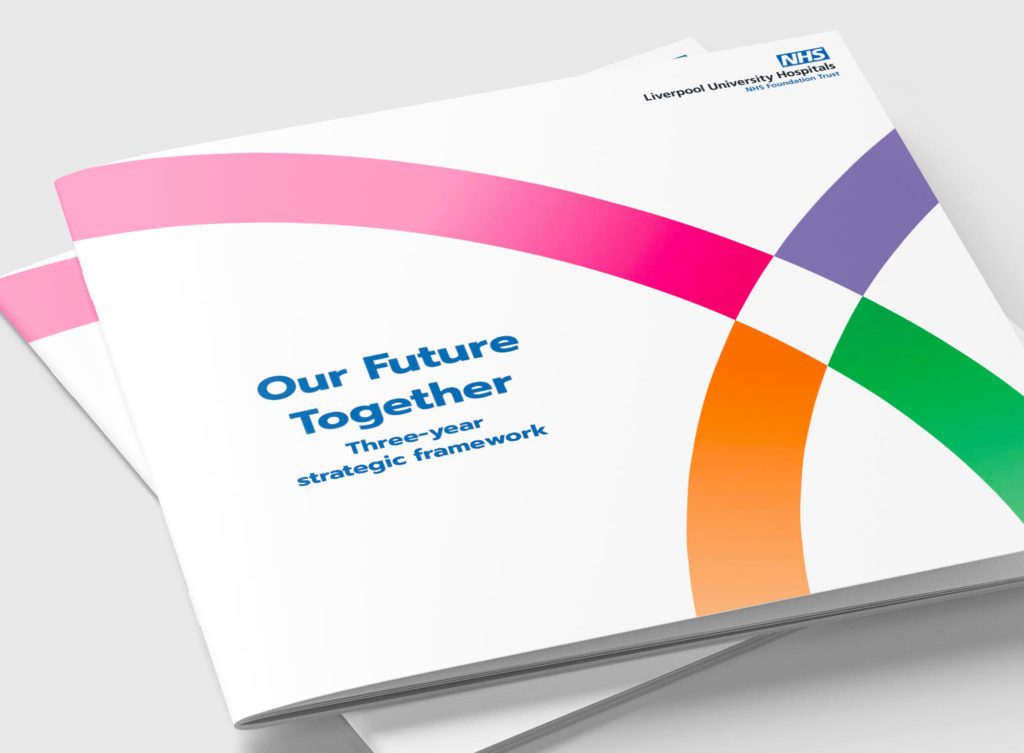
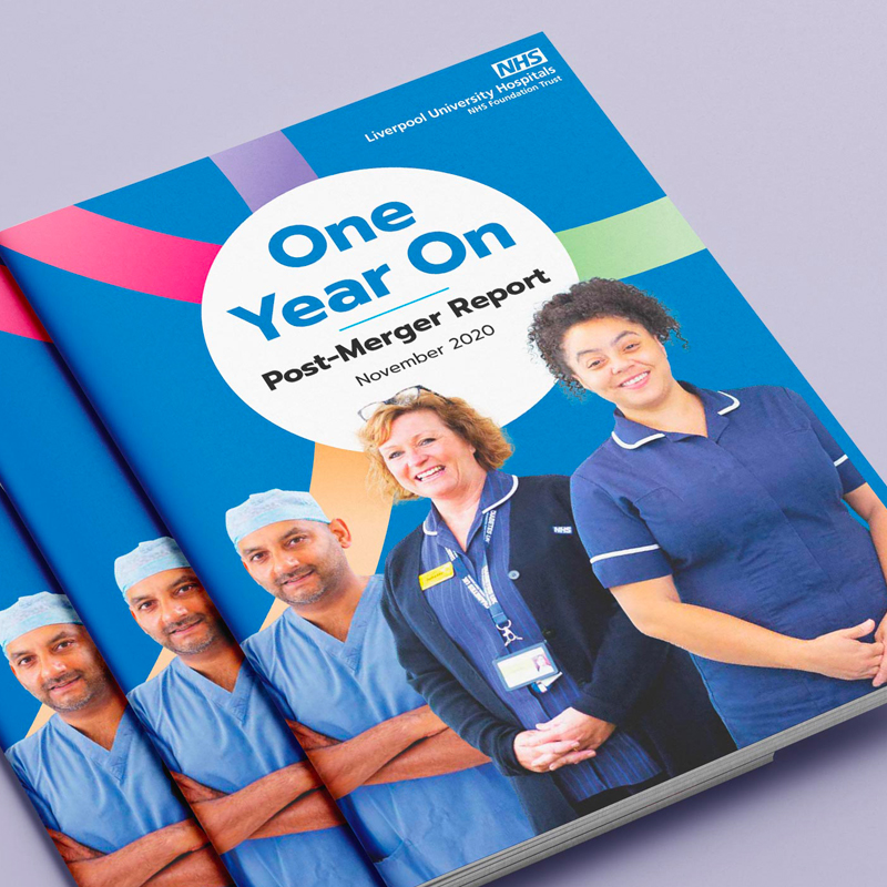
Liverpool University Hospitals NHS Foundation Trust (LUHFT) was formed through a merger of Aintree University Hospital NHS Foundation Trust and Royal Liverpool and Broadgreen University Hospital Trust.
As a new organisation, it became one of the largest acute trusts in the country and one of the biggest employers in the region with an annual budget of £930 million. Unlike many other NHS mergers, the merger was driven by the clinical staff, who made the case for bringing the two organisations together in order to improve patient care.
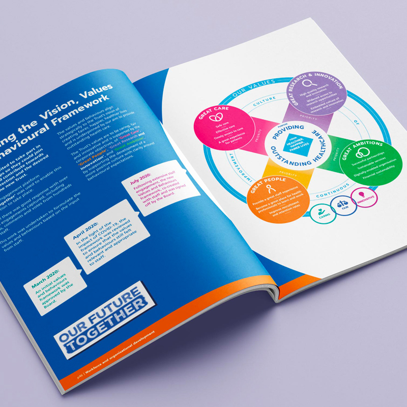
We were commissioned by LUHFT to establish a clear brand framework for how it communicates its vision, values and strategic objectives in a way that is meaningful to all stakeholders.
Using an evidence-based approach we initially carried out a wide range of engagement with LUHFTs diverse stakeholders from patients, staff and senior management through to partners, regulators and Board members. This was used as a foundation that informed a written brand narrative, positioning and tone of voice that:
Communicates what LUHFT stands for
Reflects its vision and values
Is distinctive, yet authentic
Provides a mechanism to engage staff and instil a sense of pride so that they become brand ambassadors
Becomes something that the local community can believe in, be proud of and engage with.
With the written brand story in place we then moved on to consider the visual expression of the brand; developing a unique look and feel, brand architecture and a comprehensive set of brand guidelines to inform how the brand should be brought to life across the organisation’s many touchpoints.
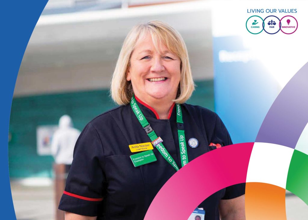
Following a period of robust testing of all aspects of the new brand amongst key stakeholder groups, it was approved for roll-out and we worked with LUFHT to deliver a range of priority communications initiatives including the roll-out of the new organisational values and strategic reports; alongside collateral to embed the new brand across video, screensavers, email, posters, infographics and more.
Why it matters
LUHFT is an anchor institution for the Liverpool City Region. It has a huge role to play in the future health and prosperity of our region, so it was vital to deliver a brand that connected with the region and the future ambition of the organisation to facilitate its growing impact.
This was a fantastic project to work on with a flagship organisation in our region. The close collaboration with multiple stakeholders throughout from initial research through to testing and implementation allowed us to develop a brand that was authentic to LUHFT and its future.
The Reader is a national charity that wants to bring about a reading revolution, so that everyone can experience and enjoy great literature, which it believe is a tool for helping humans survive and live well.
Why the Reader matters to us?
The Reader believes that the unique power of literature has the potential to connect individuals, help us feel better and to rebuild lost social bonds.
It brings people together and books to life in order to make warmer, healthier, stronger communities.
Alder Hey Children’s Hospital cares for over 330,000 children, young people and their families every year.
As one of Europe’s biggest and busiest children’s hospitals, it treats everything from common illnesses to highly complex and specialist conditions.
Why Alder Hey matters to us?
Alder Hey is an incredible organisation that does amazing things for children and their families across the UK. It is focused on the future through its innovation and pioneering research but is anchored by its unwavering commitment to giving children the very best care, and sets out to make them feel happy, safe and confident as they play, learn and grow.
Iceland Foods is a British retailer with over 900 stores across the UK and 40 owned or franchises stores in Europe.
Why Iceland matters to us?
Iceland is committed to being a truly responsible business and has placed sustainability at the heart of its strategy. We are proud to support them in communicating their ambition and significant progress they are making as they champion sustainability across the retail sector.
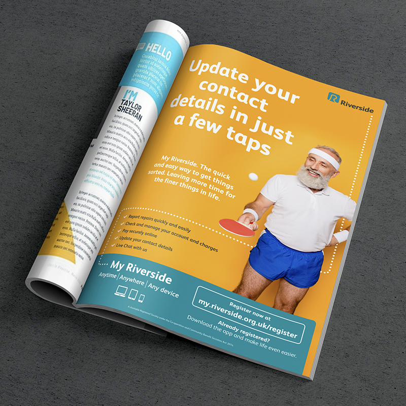
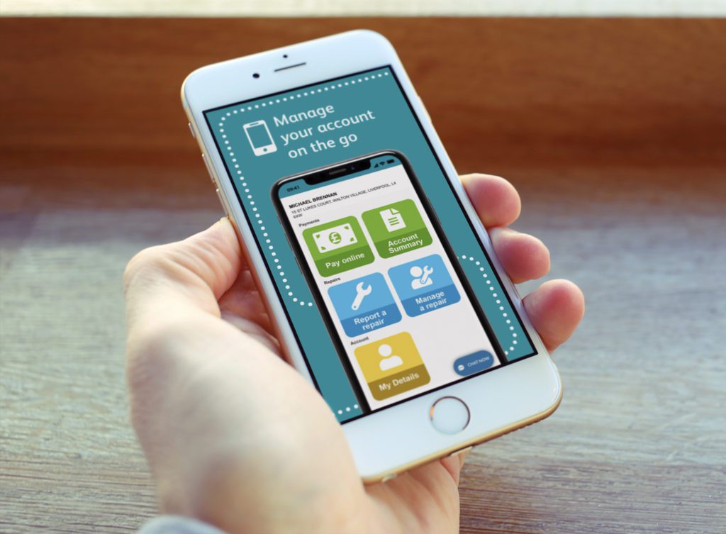
Riverside have redeveloped their customer portal, My Riverside, and commissioned Kaleidoscope to develop a new campaign to spearhead the launch and drive customer engagement with it.
My Riverside is a digital platform that enables Riverside customers the ability to easily manage their home through reporting repairs, checking accounts and making payments online.
Our initial role was to establish a distinctive creative concept that would set My Riverside apart from wider Riverside communications.
The platform had already been launched previously but did not achieve the required engagement, so this concept had to stand out and demonstrate that the platform was something to take notice of.
The concept used customer insight which highlighted the primary perceived benefit of the platform to be speed and ease of use.
We therefore built on this and brought it to life using a blend of copy lines and abstract photography, alongside a bright and vibrant colour palette, to articulate how My Riverside was quick and easy to use, and that customers could use the time they saved to do things they really wanted to do.
This was supported by a consistent logo device which reinforced the convenience of the platform and how it could be accessed anywhere, anytime and on any device.
The campaign was launched in a targeted way across Riverside’s customers using multiple print and digital channels, with different content being delivered to a range of customers segments to reflect the differing levels of service’s available in regions and variations in customer engagement with digital tools.
Why it matters
Managing a home can be complex and time consuming, and for many of us can seem overwhelming at times. The My Riverside platform aims to help make this simpler and easier and enable its customers to get on with the things that are really important to them.
Using customer insight to inform our creative direction was vital to the effectiveness of this concept – it provided absolute clarity on what was really important to Riverside’s customers.
Starting a conversation
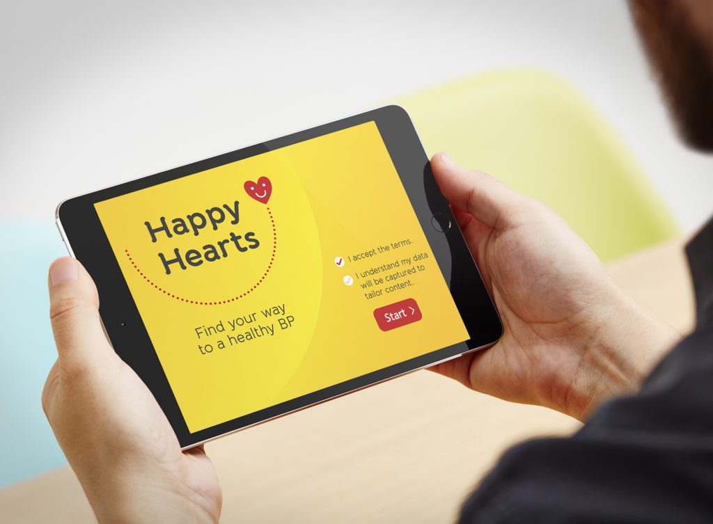
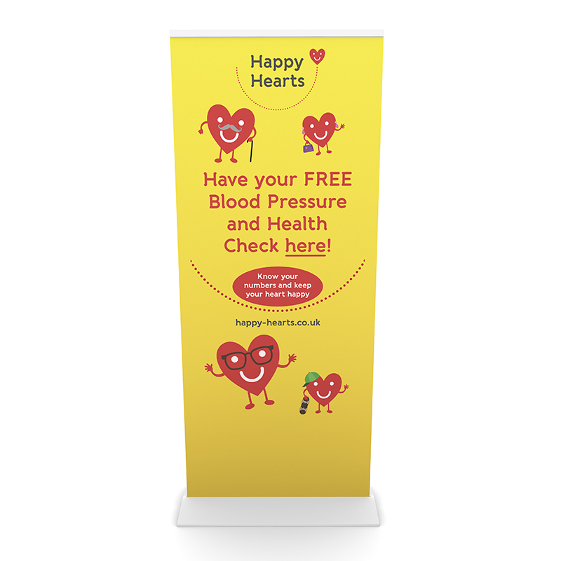
Undiagnosed hypertension is a serious problem in Cheshire and Merseyside, but many patients aren’t engaging with their own potential risks. To support pharmacies and health trainers in providing blood pressure checks in the community, we created a new digital tool to help start conversations about blood pressure and wellbeing with the public.
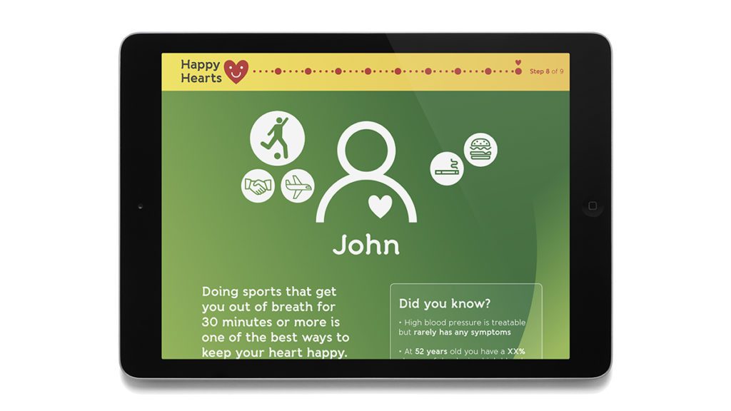
The Happy Hearts web app aids health professionals, by offering a 2-3 minute intervention that leads to a blood pressure check. It was carefully structured in a way that encourages patients to talk about themselves, their life and interests, before allowing the professional to illustrate how the health of their heart plays a crucial role in their life. This will hopefully increase their propensity to take a blood pressure check.
The project was based on a qualitative study which looked at how to motivate people to make healthy lifestyle changes. This work identified effective ways to use conversation to motivate behaviour changes around risk factors, self-care and medication adherence.
This provided us with clear insight that the brand and tool must deliver against. This allowed us to create early concepts around a brand name, identity, look and feel; and a user journey to structure the tool in a way that would support both the patient and health professional.
The tool was developed and tested in collaboration with pharmacies, health trainers and patient representatives to define the best format, content structure and tone of voice. This ensured that we were able to develop the tool in a live and dynamic way, incorporating audience feedback throughout.
On launch, the tool was rolled out alongside a training package for professionals to drive their confidence and propensity to use the tool.
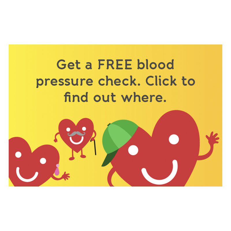
Following launch we have then gone on to deliver a wide range of targeted social media campaigns using a blend of static and animated content (see below) to engage multiple audiences across the region.
Why it matters
Undiagnosed hypertension is a serious problem in Cheshire and Merseyside, but many patients aren’t engaging with their own potential risks. Tools to spark conversations between the public and health professionals are vital to encourage people to take control of their own health on such issues.
The collaborative approach we took to co-create the brand and tool with patient representatives and health professionals was critical to the success of the project.
Impact
3.4 million reach from social ads
Since launch Happy Hearts has now become the brand for a range of related campaigns and has been utilised for practical tools in health settings, a detailed CVD website and multiple social media campaigns.
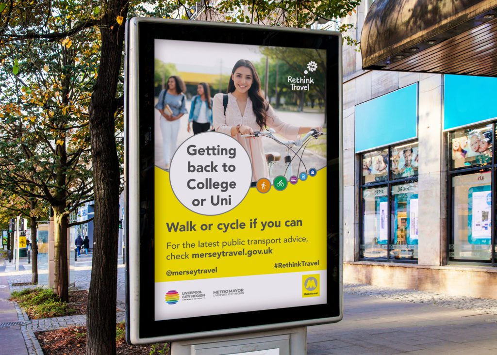
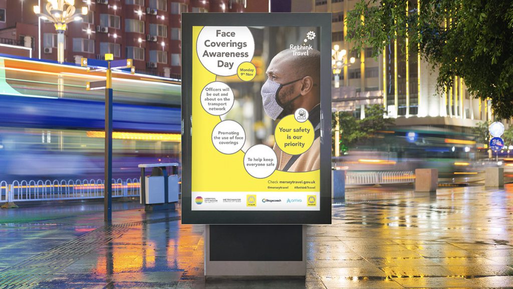
Travelling through Covid-19
The brief was triggered by the national lockdown in March 2020 and the major implications it would have on the city region’s transport network in terms of service provision, capacity and passenger safety.
The core objectives were to:
Influence customer behaviour on choice of transport mode and expectations of them when travelling, protecting the safety of staff and the general public.
Manage customer expectations, ensuring they understood the rationale for the levels of service being provided
Ensure customers who still needed to travel by public transport have access to relevant and timely information about services
Using this evidence, an overarching campaign concept was established – ‘Rethink Travel’. The concept was simple, instructional but emotionally engaging. It was flexible and would work whatever the message Crucially, it would also work under any national message e.g ‘Stay Home. Protect the NHS. Save Lives.’
The overarching concept was supported by a positioning line which was positive, inclusive and built on the vital sense of togetherness: ‘We can all help keep each other safe’.
A detailed messaging framework was also developed to inform the campaign roll-out.
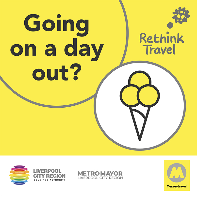
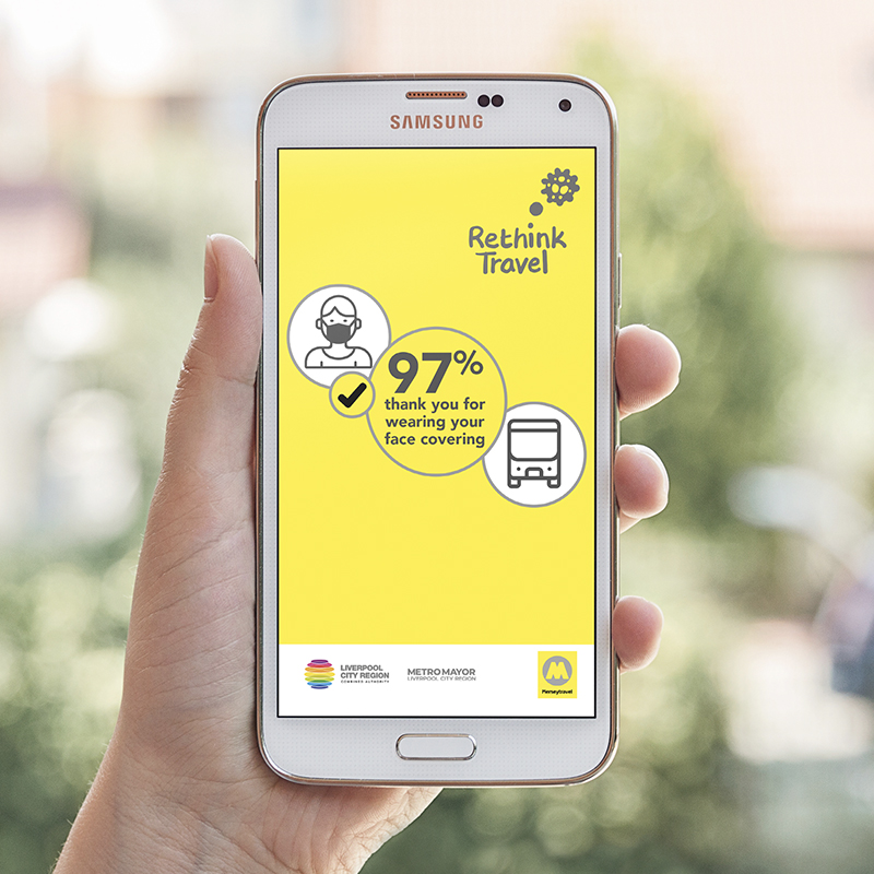
A visual identity was developed to bring the messaging to life using a flexible framework of illustrations, digital icons and photography; while still remaining on brand with LCRCA to provide a clear link to the ownership of the campaign.
The campaign was implemented across multiple channels from outdoor, news media advertising (print and digital), social media (organic and paid-for), videos and radio through to signage, uniform, print and more.
Campaign activity has been phased and targeted throughout the campaign to reflect the changing dynamics of Covid-19, encompassing direct informational messaging through to encouraging people to get active and walk or cycle to work rather than using cars, buses or trains. Similarly, the return to school and Universityrequired new phases to reassure and guide parents and students on how to travel safely – including a bespoke package for local schools.
Why it matters
Covid-19 is a once in a generation global crisis that has thrown every aspect of our lives into question. This means that clear and consistent communications has been more important than ever to help people make the right decision and keep themselves and others safe when travelling.
Having absolute clarity on the core messaging and visual identity has been crucial – the campaign has been delivered within an ever-changing landscape in which we have had to switch direction in a matter of hours due to a new Government directive.
Impact
Face covering compliance at 90%+ throughout
Use of the public transport network was higher than national average (e.g. bus patronage at 35% compared with 25% nationally), demonstrating the campaign reassured people who needed to use public transport that they still could
Manage Cookie Consent
To provide the best experiences, we use technologies like cookies to store and/or access device information. Consenting to these technologies will allow us to process data such as browsing behavior or unique IDs on this site. Not consenting or withdrawing consent, may adversely affect certain features and functions.
Functional
Always active
The technical storage or access is strictly necessary for the legitimate purpose of enabling the use of a specific service explicitly requested by the subscriber or user, or for the sole purpose of carrying out the transmission of a communication over an electronic communications network.
Preferences
The technical storage or access is necessary for the legitimate purpose of storing preferences that are not requested by the subscriber or user.
Statistics
The technical storage or access that is used exclusively for statistical purposes.The technical storage or access that is used exclusively for anonymous statistical purposes. Without a subpoena, voluntary compliance on the part of your Internet Service Provider, or additional records from a third party, information stored or retrieved for this purpose alone cannot usually be used to identify you.
Marketing
The technical storage or access is required to create user profiles to send advertising, or to track the user on a website or across several websites for similar marketing purposes.