Liverpool Heart and Chest Hospital (LHCH)is the largest single site specialist heart and chest hospital in the country, providing specialist services in cardiothoracic surgery, cardiology, respiratory medicine including adult cystic fibrosis and diagnostic imaging
Why LHCH matters to us
Heart and lung disease continue to be amongst the biggest killers in the UK. LHCH serves communities that are marked by increased prevalence of cardiovascular disease, higher levels of heart failure, hypertension, coronary artery disease and an ageing population.
Multiple public-facing campaigns on priorities linked to heart health
Digital engagement tools
What was the challenge?
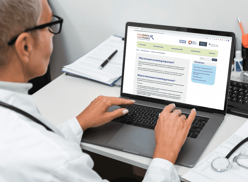
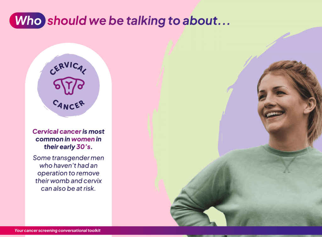
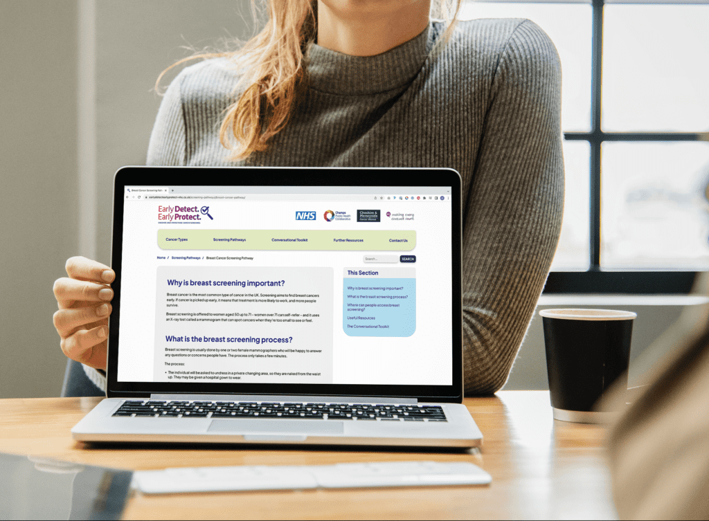
Champs wanted to help support healthcare and community professionals in starting conversations about screening for breast, bowel and cervical cancers with people living in Cheshire and Merseyside.
They commissioned Kaleidoscope to help build an informative website platform and communications toolkit, with an overarching aim to educate and empower everyone from GPs to community nurses, community professionals and volunteers so they can start more early conversations about screening with the people they see every day.
Working closely with Champs, we reviewed their plan for the promotion of cancer screening and how a website and communication toolkit could support this ambition. As a result, we developed a new digital platform that provides professionals with all the information they may need to promote and talk about cancer screening within community settings.
The development of the platform initially focused on the creation of a new name ‘Early Detect, Early Protect’ and an accompanying look/feel which was tested amongst a representative sample of the target audience to ensure relevance and credibility.
Using an extensive research base, we then established a user journey for the platform that would define the content structure and flow, and provided the framework for us to move ahead into full design and development.
The platform consists of a number of areas of key content including information on different cancer types and different screening pathways to demystify what screening is and the steps involved.
This is supported by a resource toolkit, including a suite of posters and social media posts, that professionals can download and use to promote cancer screening within their communities. In addition a resource section displays a collection of relevant resources in an archive which users can filter using a number of categories.
Why it matters
400 users in first four weeks of launch
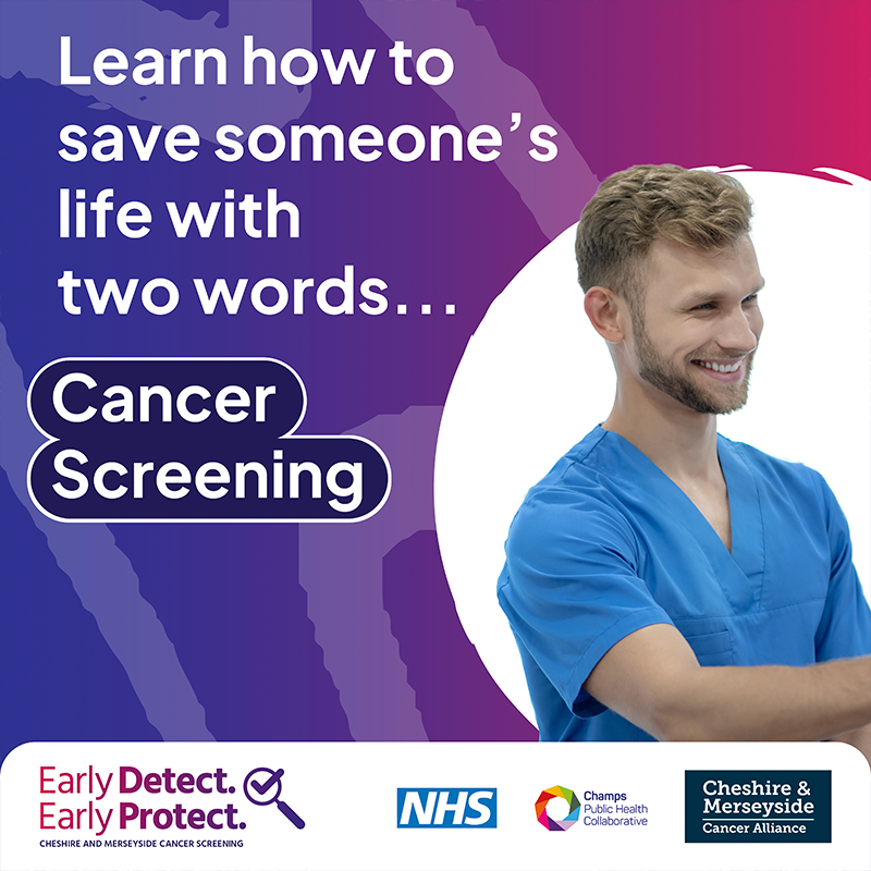
Catching cancer early saves lives. If we can detect it and start treatment early, it’s more likely to work – and more people will survive.
MYA is a charity dedicated to providing innovative support and opportunities for young people across Merseyside.
Why MYA matters to us
Since 1890 MYA has been creating real, wide-reaching change that ensures children and young people are better equipped to shape their own futures.
Alternative Futures Group (AFG) is one of the largest not-for-profit Health and Social Care charities in the North West.
Why AFG matters to us
AFG has been changing lives, creating independence and achieving great outcomes for the brilliant people it supports for over 30 years – that is something that really matters.
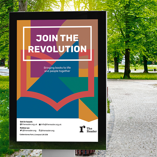
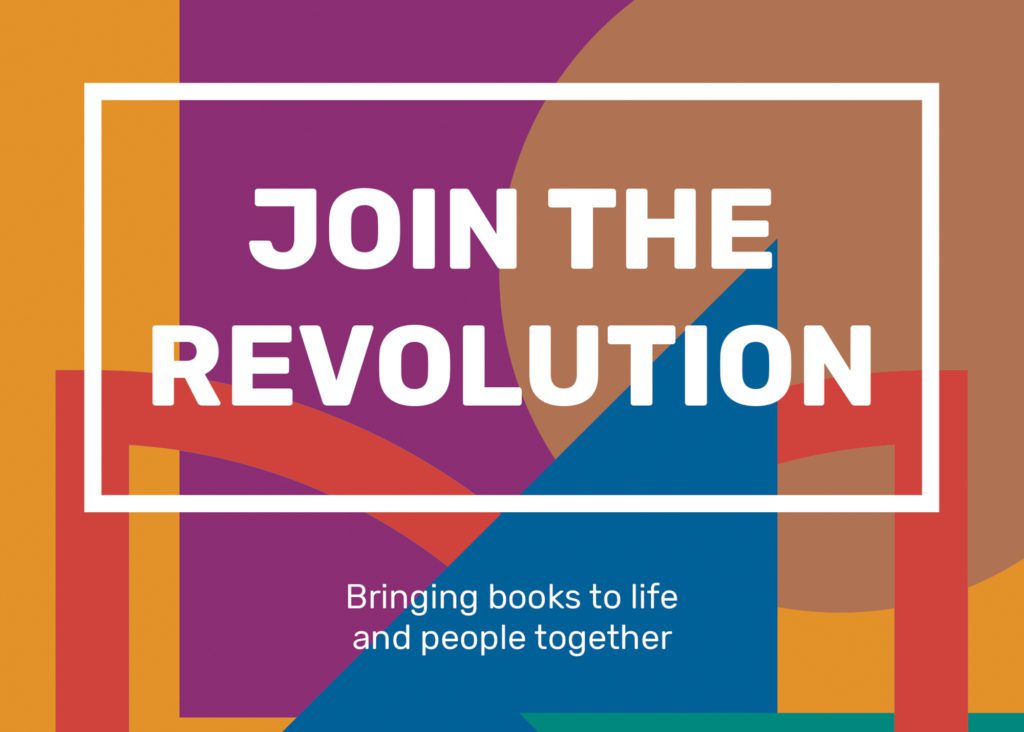
The visual identity was developed to communicate the warmth and connection of the ‘reading revolution’ at the heart of The Reader’s work.
It aims to communicate all aspects of The Reader’s brand to reflect who they are today – a warm, radical and dynamic organisation that has literature and people at its heart.
The updated identity includes a refined version of The Reader’s previous organisational logo that will help the charity to attract a more age-diverse audience as it looks to scale its reading revolution. The simplified design has been chosen to work better across digital platforms.
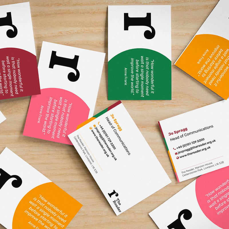
We also created a family of sub-brands for the visitor experiences on offer at The Reader at Calderstones. These range from The Reader Storybarn, an imaginative playspace dedicated to the delights of reading for pleasure in families, to The Reader’s social enterprises, including the Café and Ice Cream Parlour, which generate revenues to support the charity’s work with communities.
The identity was developed in a pragmatic fashion, using practical working sessions with senior leaders from The Reader to define a clear brand hierarchy and strategy, ahead of developing visual approaches and brand guidelines in a timeframe of just eight weeks.
Why it matters
The Reader believes that the unique power of literature has the potential to connect individuals, help us feel better and to rebuild lost social bonds.
It brings people together and books to life in order to make warmer, healthier, stronger communities.
This was a wonderful project to be involved with an organisation that has incredible ambitions to grow its social impact and deliver lasting impact to the communities it serves and the wider health and well-being sector.
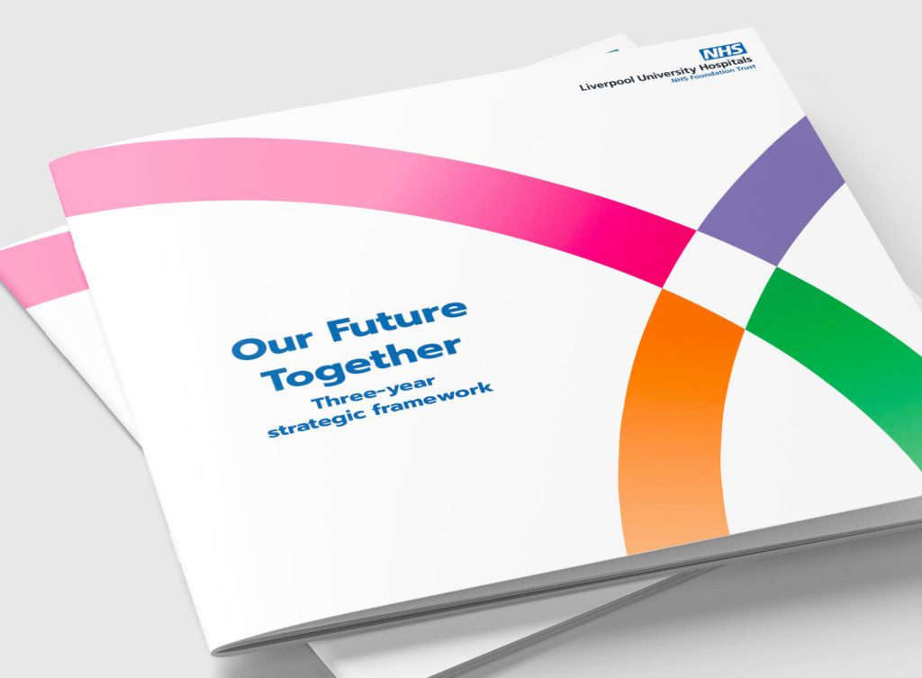
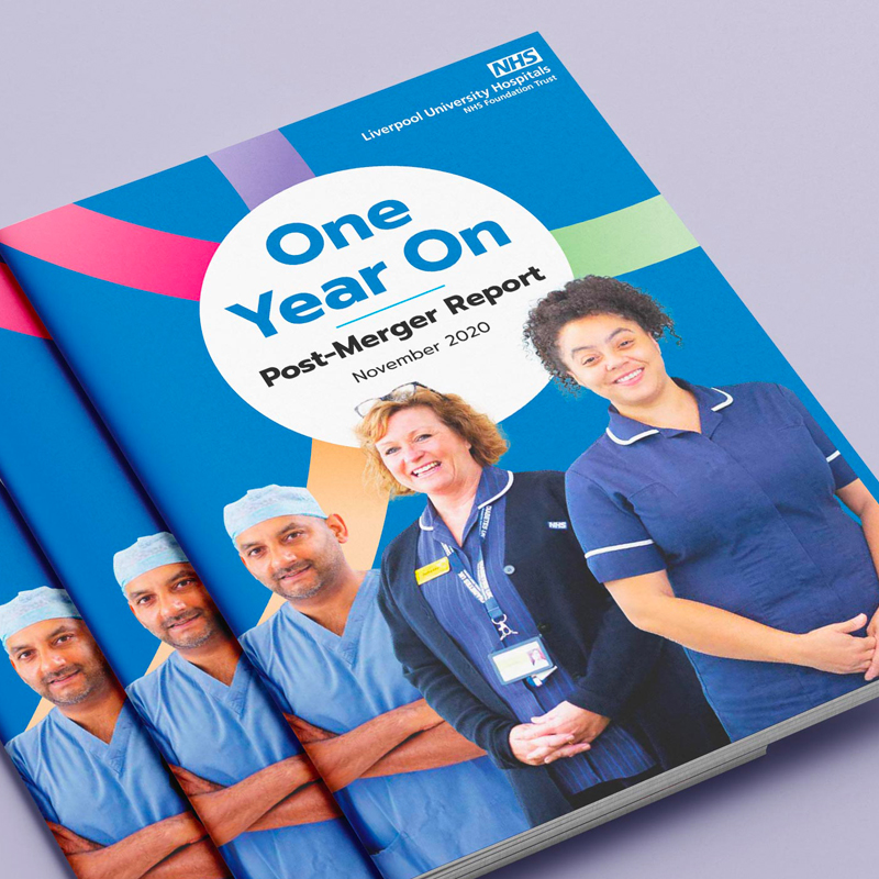
Our future together
Liverpool University Hospitals NHS Foundation Trust (LUHFT) was formed through a merger of Aintree University Hospital NHS Foundation Trust and Royal Liverpool and Broadgreen University Hospital Trust.
As a new organisation, it became one of the largest acute trusts in the country and one of the biggest employers in the region with an annual budget of £930 million. Unlike many other NHS mergers, the merger was driven by the clinical staff, who made the case for bringing the two organisations together in order to improve patient care.
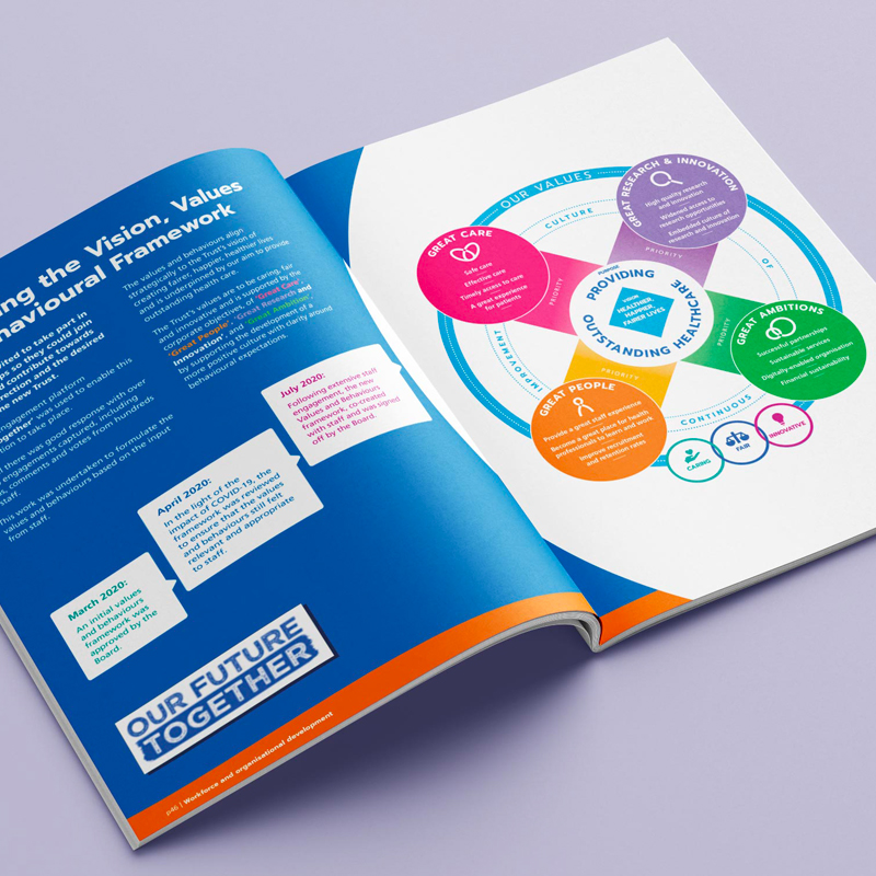
We were commissioned by LUHFT to establish a clear brand framework for how it communicates its vision, values and strategic objectives in a way that is meaningful to all stakeholders.
Using an evidence-based approach we initially carried out a wide range of engagement with LUHFTs diverse stakeholders from patients, staff and senior management through to partners, regulators and Board members. This was used as a foundation that informed a written brand narrative, positioning and tone of voice that:
Communicates what LUHFT stands for
Reflects its vision and values
Is distinctive, yet authentic
Provides a mechanism to engage staff and instil a sense of pride so that they become brand ambassadors
Becomes something that the local community can believe in, be proud of and engage with.
With the written brand story in place we then moved on to consider the visual expression of the brand; developing a unique look and feel, brand architecture and a comprehensive set of brand guidelines to inform how the brand should be brought to life across the organisation’s many touchpoints.
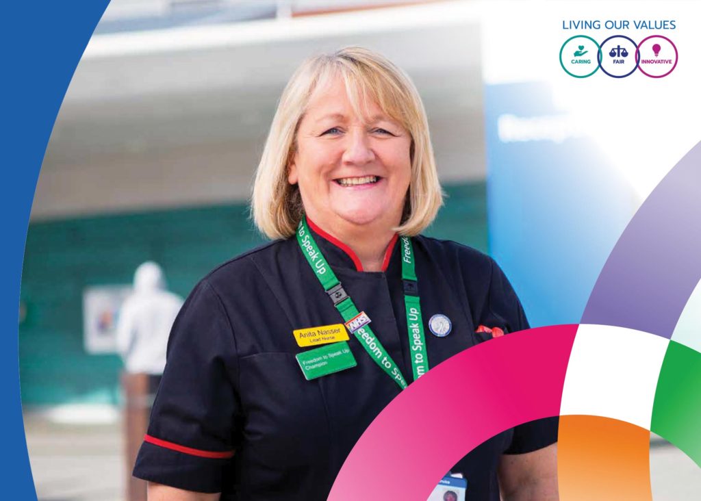
Following a period of robust testing of all aspects of the new brand amongst key stakeholder groups, it was approved for roll-out and we worked with LUFHT to deliver a range of priority communications initiatives including the roll-out of the new organisational values and strategic reports; alongside collateral to embed the new brand across video, screensavers, email, posters, infographics and more.
Why it matters
LUHFT is an anchor institution for the Liverpool City Region. It has a huge role to play in the future health and prosperity of our region, so it was vital to deliver a brand that connected with the region and the future ambition of the organisation to facilitate its growing impact.
This was a fantastic project to work on with a flagship organisation in our region. The close collaboration with multiple stakeholders throughout from initial research through to testing and implementation allowed us to develop a brand that was authentic to LUHFT and its future.
The Reader is a national charity that wants to bring about a reading revolution, so that everyone can experience and enjoy great literature, which it believe is a tool for helping humans survive and live well.
Why the Reader matters to us?
The Reader believes that the unique power of literature has the potential to connect individuals, help us feel better and to rebuild lost social bonds.
It brings people together and books to life in order to make warmer, healthier, stronger communities.
Iceland Foods Charitable Foundation (IFCF) has donated an incredible £30 million to date since its launch in 1973.
Why IFCF matters to us?
IFCF has a mission: to make life better for people.That’s why it raises money and awareness for good causes – and because it believes it’s simply the right thing to do.
Dyslexia Scotland is a national charity dedicated to enabling people with dyslexia in Scotland to realise their potential.
Why Dyslexia Scotland matters to us?
Dyslexia Scotland is committed to a vision of making Scotland a dyslexia-friendly country that values the skills and talents of dyslexic people. It is working to inspire and enable dyslexic people to reach their potential in life, learning and work
Various digital platforms to engage multiple stakeholders
Manage Cookie Consent
To provide the best experiences, we use technologies like cookies to store and/or access device information. Consenting to these technologies will allow us to process data such as browsing behavior or unique IDs on this site. Not consenting or withdrawing consent, may adversely affect certain features and functions.
Functional
Always active
The technical storage or access is strictly necessary for the legitimate purpose of enabling the use of a specific service explicitly requested by the subscriber or user, or for the sole purpose of carrying out the transmission of a communication over an electronic communications network.
Preferences
The technical storage or access is necessary for the legitimate purpose of storing preferences that are not requested by the subscriber or user.
Statistics
The technical storage or access that is used exclusively for statistical purposes.The technical storage or access that is used exclusively for anonymous statistical purposes. Without a subpoena, voluntary compliance on the part of your Internet Service Provider, or additional records from a third party, information stored or retrieved for this purpose alone cannot usually be used to identify you.
Marketing
The technical storage or access is required to create user profiles to send advertising, or to track the user on a website or across several websites for similar marketing purposes.