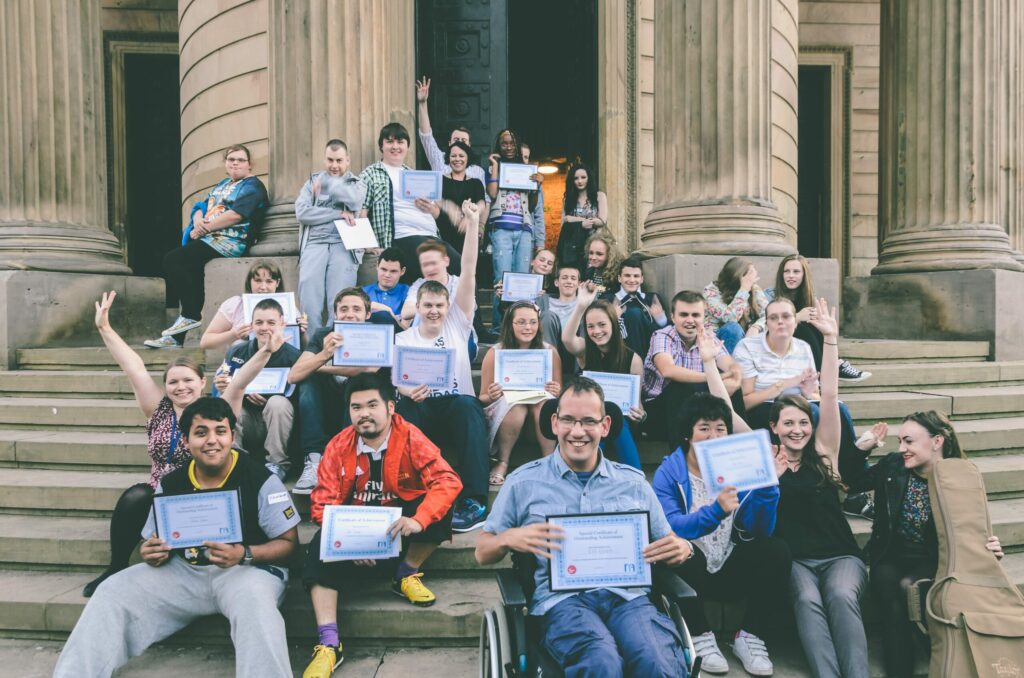
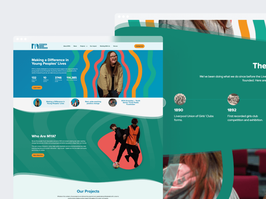
Merseyside Youth Association has a long and extraordinary history, dating all the way back to 1890. Grounded in the incredible social history of Liverpool, our affiliated clubs and their predecessors have been helping young people cope with all kinds of challenges.
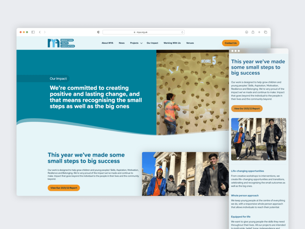
We worked with MYA to define and articulate a new brand identity, written and visual, to enable them to express their incredible narrative and the impact they deliver for people across Merseyside.
Defining the brand pillars
Using a robust, collaborative approach with the MYA team, we initially explored what MYA means to its passionate workforce, the difference it makes to its many stakeholders and what the future holds for the organisation. This gave us a base from which we were able to develop some early creative territories and brand ‘pillars’ for the brand to explore, which were then shared back with the MYA team to test, challenge and refine through collaborative working sessions.
With the building blocks in place we then moved into the development of a full brand narrative which will act as the spine for future written brand communications – providing a consistent and coherent framework for delivering the many powerful stories that MYA has from its wonderful work with young people and children across the region.
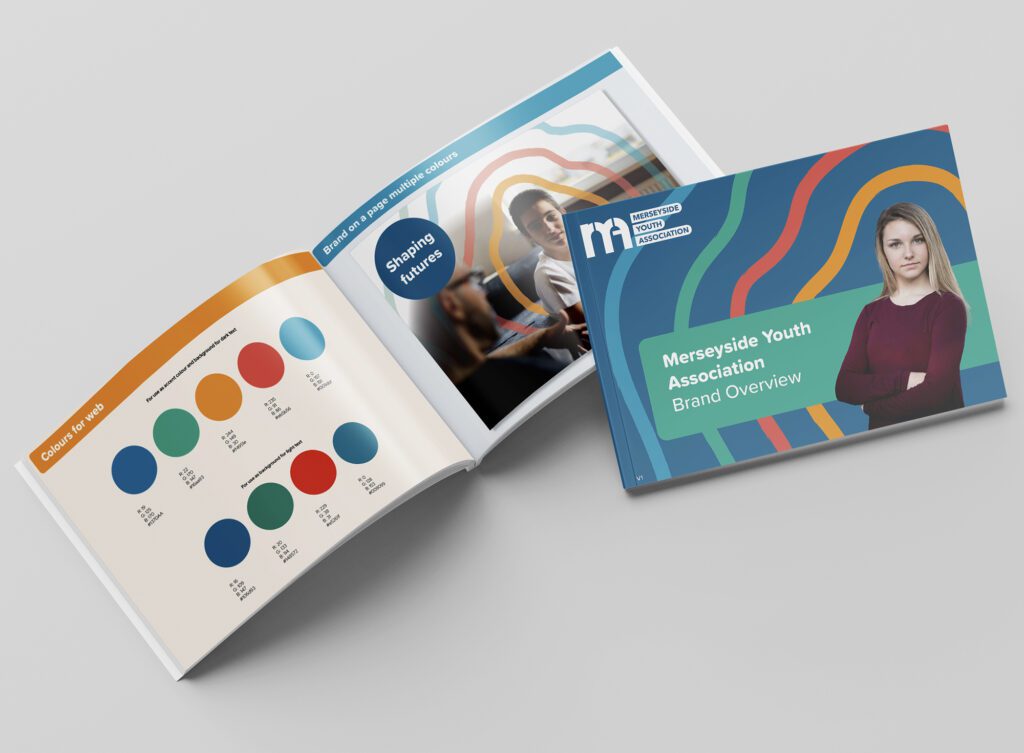
Bringing a brand to life
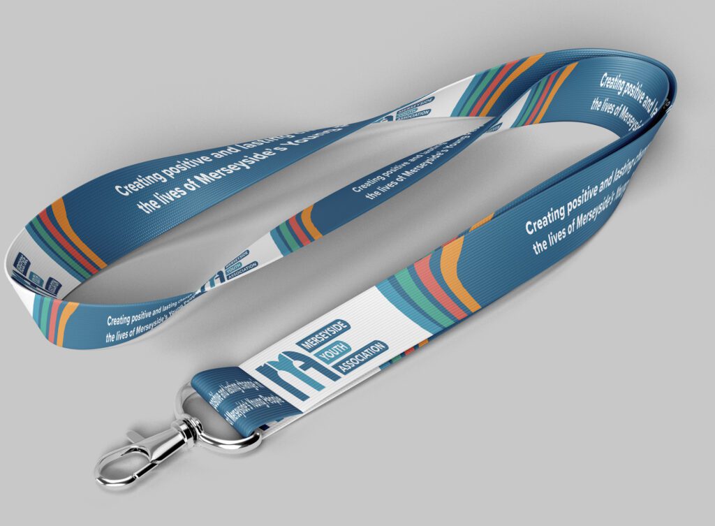
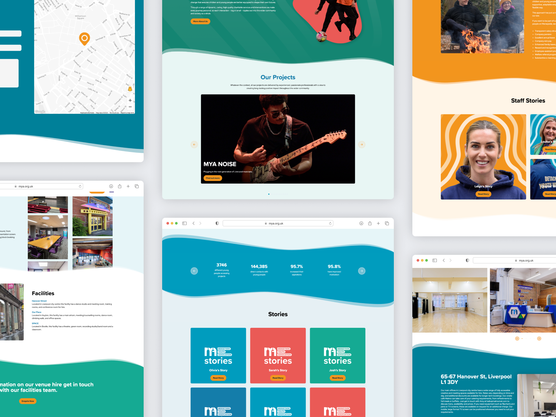
The written narrative was then brought to life through a fresh, new visual design style that will be used to lead brand communications in the future. Building on the notion of how MYA creates incredible impact that ripples outwards from an individual through to families, communities and beyond a design system was created to reflect this sense of growth.
Shaped around the individual, the graphic ‘ripple’ is always tailored to the young person that MYA is supporting and is used in an organic way across different channels.
A broad, warm colour palette was selected to give the brand flexibility and scalability; alongside a friendly primary font to reflect the personal, accessible nature of the MYA brand.
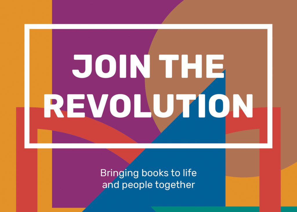
Radical and dynamic
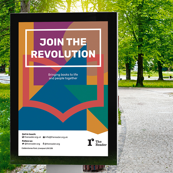
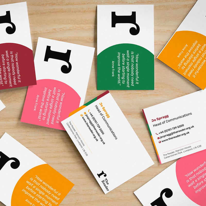
The visual identity was developed to communicate the warmth and connection of the ‘reading revolution’ at the heart of The Reader’s work.
It aims to communicate all aspects of The Reader’s brand to reflect who they are today – a warm, radical and dynamic organisation that has literature and people at its heart.
The updated identity includes a refined version of The Reader’s previous organisational logo that will help the charity to attract a more age-diverse audience as it looks to scale its reading revolution. The simplified design has been chosen to work better across digital platforms.
We also created a family of sub-brands for the visitor experiences on offer at The Reader at Calderstones. These range from The Reader Storybarn, an imaginative playspace dedicated to the delights of reading for pleasure in families, to The Reader’s social enterprises, including the Café and Ice Cream Parlour, which generate revenues to support the charity’s work with communities.
The identity was developed in a pragmatic fashion, using practical working sessions with senior leaders from The Reader to define a clear brand hierarchy and strategy, ahead of developing visual approaches and brand guidelines in a timeframe of just eight weeks.
Why it matters
The Reader believes that the unique power of literature has the potential to connect individuals, help us feel better and to rebuild lost social bonds.
It brings people together and books to life in order to make warmer, healthier, stronger communities.
This was a wonderful project to be involved with an organisation that has incredible ambitions to grow its social impact and deliver lasting impact to the communities it serves and the wider health and well-being sector.
Creative for a global audience
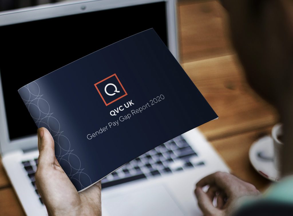
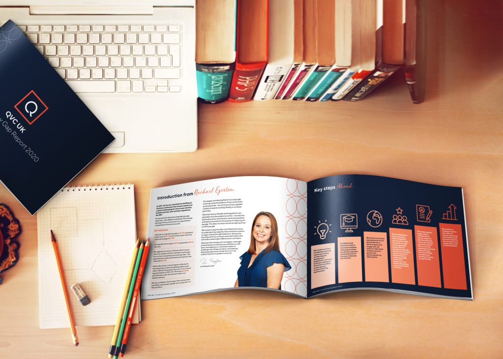
Our work has included the development of a range of reports, presentations and digital content on issues such as culture, gender pay gaps and celebratory events.
Working within the QVC brand guidelines we have worked collaboratively with the QVC team to understand their ambitions and have provided fresh, creative thinking to deliver brand communications of the highest standard that could operate across different teams, countries and continents.
Why it matters
Engaged employees lead to improved productivity and efficiency, retention of customers and reduce the turnover in staff. Most importantly, engaged employees are happier, both at work and in their lives. We believe that it is therefore vital to deliver effective and impactful internal communications across any organisation to raise engagement levels, none-more so than at QVC where over 20,000 staff work in multiple locations across the globe.
Taking time to understand the QVC brand identity has been crucial in allowing us to activate it effectively across the multiple projects and channels that we’ve delivered.
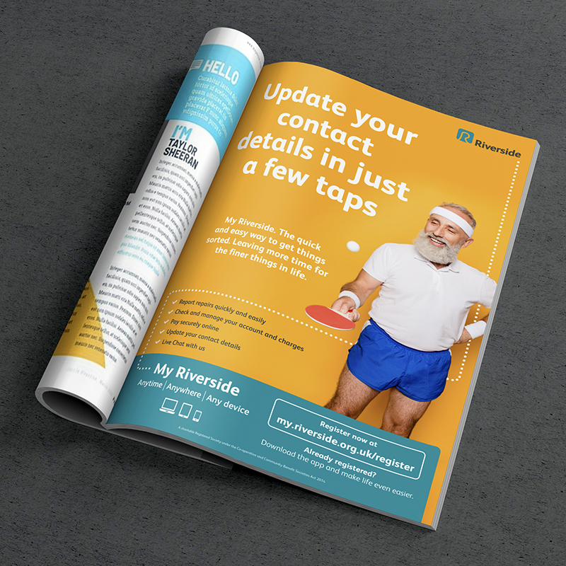
Making life easier
Riverside have redeveloped their customer portal, My Riverside, and commissioned Kaleidoscope to develop a new campaign to spearhead the launch and drive customer engagement with it.
My Riverside is a digital platform that enables Riverside customers the ability to easily manage their home through reporting repairs, checking accounts and making payments online.
Our initial role was to establish a distinctive creative concept that would set My Riverside apart from wider Riverside communications.
The platform had already been launched previously but did not achieve the required engagement, so this concept had to stand out and demonstrate that the platform was something to take notice of.
The concept used customer insight which highlighted the primary perceived benefit of the platform to be speed and ease of use.
We therefore built on this and brought it to life using a blend of copy lines and abstract photography, alongside a bright and vibrant colour palette, to articulate how My Riverside was quick and easy to use, and that customers could use the time they saved to do things they really wanted to do.
This was supported by a consistent logo device which reinforced the convenience of the platform and how it could be accessed anywhere, anytime and on any device.
The campaign was launched in a targeted way across Riverside’s customers using multiple print and digital channels, with different content being delivered to a range of customers segments to reflect the differing levels of service’s available in regions and variations in customer engagement with digital tools.
Why it matters
Managing a home can be complex and time consuming, and for many of us can seem overwhelming at times. The My Riverside platform aims to help make this simpler and easier and enable its customers to get on with the things that are really important to them.
Using customer insight to inform our creative direction was vital to the effectiveness of this concept – it provided absolute clarity on what was really important to Riverside’s customers.
Manage Cookie Consent
To provide the best experiences, we use technologies like cookies to store and/or access device information. Consenting to these technologies will allow us to process data such as browsing behavior or unique IDs on this site. Not consenting or withdrawing consent, may adversely affect certain features and functions.
Functional
Always active
The technical storage or access is strictly necessary for the legitimate purpose of enabling the use of a specific service explicitly requested by the subscriber or user, or for the sole purpose of carrying out the transmission of a communication over an electronic communications network.
Preferences
The technical storage or access is necessary for the legitimate purpose of storing preferences that are not requested by the subscriber or user.
Statistics
The technical storage or access that is used exclusively for statistical purposes.The technical storage or access that is used exclusively for anonymous statistical purposes. Without a subpoena, voluntary compliance on the part of your Internet Service Provider, or additional records from a third party, information stored or retrieved for this purpose alone cannot usually be used to identify you.
Marketing
The technical storage or access is required to create user profiles to send advertising, or to track the user on a website or across several websites for similar marketing purposes.