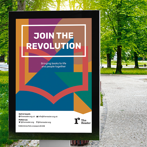
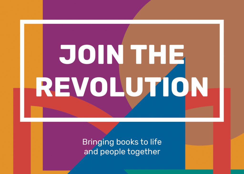
Radical and dynamic
The visual identity was developed to communicate the warmth and connection of the ‘reading revolution’ at the heart of The Reader’s work.
It aims to communicate all aspects of The Reader’s brand to reflect who they are today – a warm, radical and dynamic organisation that has literature and people at its heart.
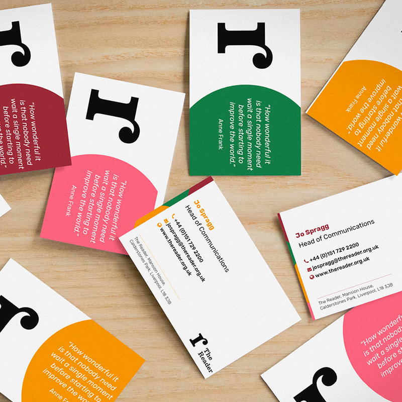
The updated identity includes a refined version of The Reader’s previous organisational logo that will help the charity to attract a more age-diverse audience as it looks to scale its reading revolution. The simplified design has been chosen to work better across digital platforms.
We also created a family of sub-brands for the visitor experiences on offer at The Reader at Calderstones. These range from The Reader Storybarn, an imaginative playspace dedicated to the delights of reading for pleasure in families, to The Reader’s social enterprises, including the Café and Ice Cream Parlour, which generate revenues to support the charity’s work with communities.
The identity was developed in a pragmatic fashion, using practical working sessions with senior leaders from The Reader to define a clear brand hierarchy and strategy, ahead of developing visual approaches and brand guidelines in a timeframe of just eight weeks.
Why it matters
The Reader believes that the unique power of literature has the potential to connect individuals, help us feel better and to rebuild lost social bonds.
It brings people together and books to life in order to make warmer, healthier, stronger communities.
This was a wonderful project to be involved with an organisation that has incredible ambitions to grow its social impact and deliver lasting impact to the communities it serves and the wider health and well-being sector.