At Kaleidoscope, our core values serve as the guiding principles for everything we do, from our daily operations to the partnerships we forge. So we wanted to share how our values – honesty and openness, unwavering commitment to quality, collaboration, pushing boundaries, and agility – influence our client selection process, and why working with like-minded clients leads to exceptional results.
Honest and open Transparent communication is the foundation of any successful partnership. We seek clients who embrace openness, allowing us to exchange ideas and feedback freely. By valuing honesty and transparency, we foster trust and understanding, ensuring everyone’s voice is heard throughout the creative process.
Commitment to quality Our dedication to delivering top-notch work is paramount, and we look for clients who share this passion for excellence. Working with clients who demand high-quality results pushes us to consistently exceed expectations and produce outstanding creative solutions.
Working together for success Collaboration is at the heart of our company. We believe that working together as a united team with our clients leads to breakthrough ideas and effective problem-solving. By partnering with clients who value teamwork, we create a supportive environment where everyone’s strengths are leveraged for success.
Pushing boundaries Creativity thrives when we venture beyond the status quo. We seek clients who are eager to explore new horizons, challenge industry norms, and embrace innovative ideas. By aligning with clients who value pushing boundaries, we foster an environment where bold ideas flourish.
Agility and responsiveness In the fast-paced world of communications, adaptability is crucial. We prioritise clients who appreciate our ability to respond swiftly to changes and opportunities, ensuring we can navigate challenges effectively and seize emerging opportunities.
Our company values are instrumental in shaping the partnerships we form and the work we produce. By choosing clients who share our commitment to honesty, quality, collaboration, innovation, and agility, we cultivate an environment that nurtures success, creativity, and growth for both parties. Think there’s a fit with how your organisation works? Drop us a line!
We are quickly moving through 2024 and as March approaches, the Kaleidoscope team is gearing up to dive into the trends that’ll shape our communication game. We want to look at how colour trends may impact the way that we as a team create communications that matter and more importantly… that resonate with our audiences!
We all know that colour has the power to support nonverbal communication and allows brands to evoke emotional responses and communicate their values clearly to their audiences…according to the savvy folks at Hubspot, colour is the VIP of first impressions for consumers. They tie emotions and vibes to colours (think black for luxury), which then shape their perception of a product or brand. Check out their insights on the psychology of colour [here].
So with that being said, what colour trends does 2024 have in store for us marketeers?
Drumroll, please! Let’s welcome the warm and fuzzy vibes of Pantone’s colour of the year, PANTONE 13-1023 Peach Fuzz. Picture a velvety, gentle peach tone wrapping you in an all-encompassing embrace that nourishes the mind, body, and soul. Leatrice Eiseman, the Executive Director at Pantone Color Institute, spills the beans: “We went for a colour that echoes our deep craving for closeness and connection—a hue that exudes warmth and modern elegance. It’s a shade that sings with compassion, offering a tactile hug and effortlessly bridging the gap between youthful exuberance and timeless charm.”
Sounds great right? Warmth, closeness and compassion are a trio of emotions I think we can all get on board with! We would love to hear how you use colour in your brand and how you think that affects how you communicate with your audience.
We are delighted to announce our certification as a B Corporation (or B Corp), joining a growing group of companies reinventing business by pursuing purpose as well as profit. Kaleidoscope has been certified by B Lab, the not-for-profit behind the B Corp movement, as having met rigorous social and environmental standards which represent its commitment to goals outside of shareholder profit.
The B Corp certification addresses the entirety of a business’ operations and covers five key impact areas of Governance, Workers, Community, Environment and Customers. The certification process is rigorous, with applicants required to reach a benchmark score of over 80 while providing evidence of socially and environmentally responsible practices relating to energy supplies, waste and water use, worker compensation, diversity and corporate transparency. To complete the certification, we have legally embedded our commitment to purpose beyond profit in our company articles.
Kaleidoscope is now part of a community of 7,000 businesses globally who have certified as B Corps. The B Corp community in the UK, representing a broad cross section of industries and sizes, comprises over 1,500 companies and include well-known brands such as The Guardian, innocent, Patagonia, The Body Shop and organic food pioneers Abel & Cole.
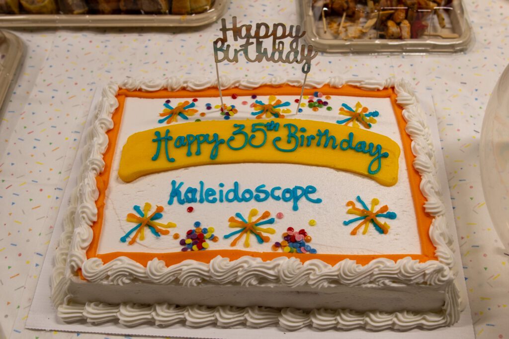
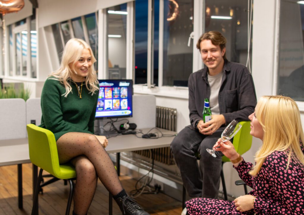
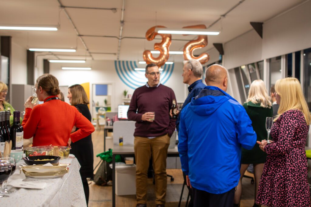
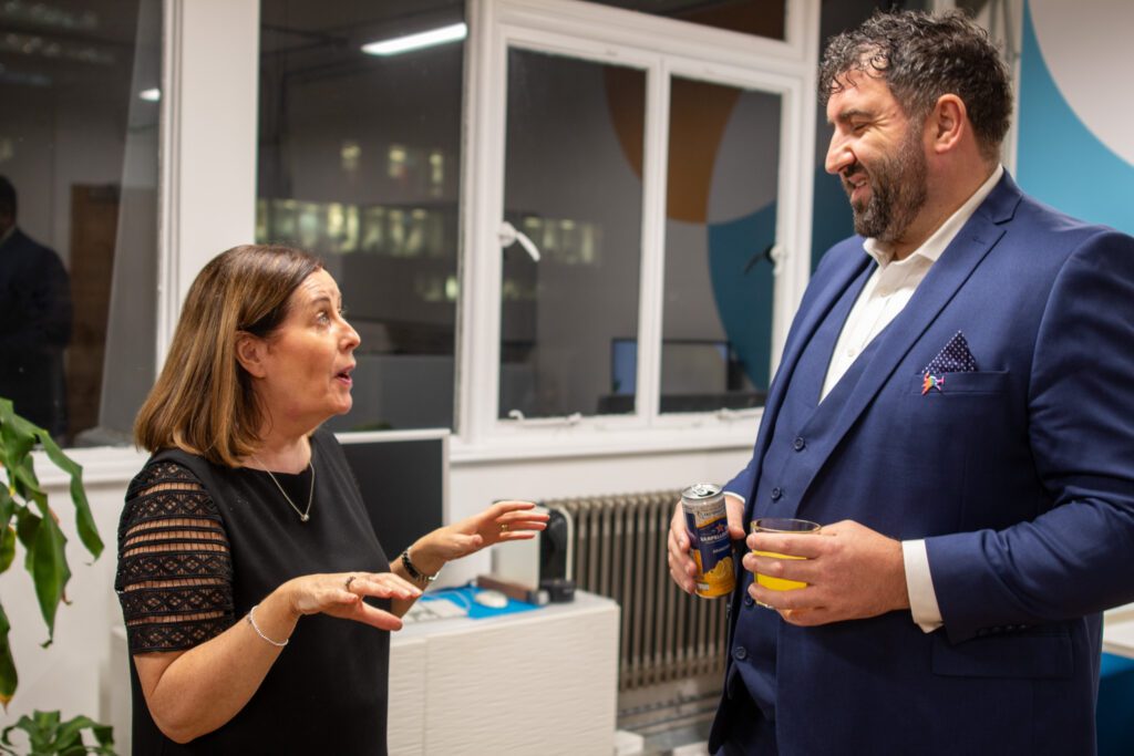
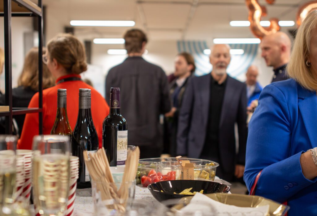
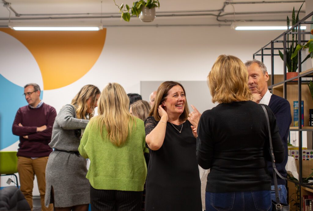
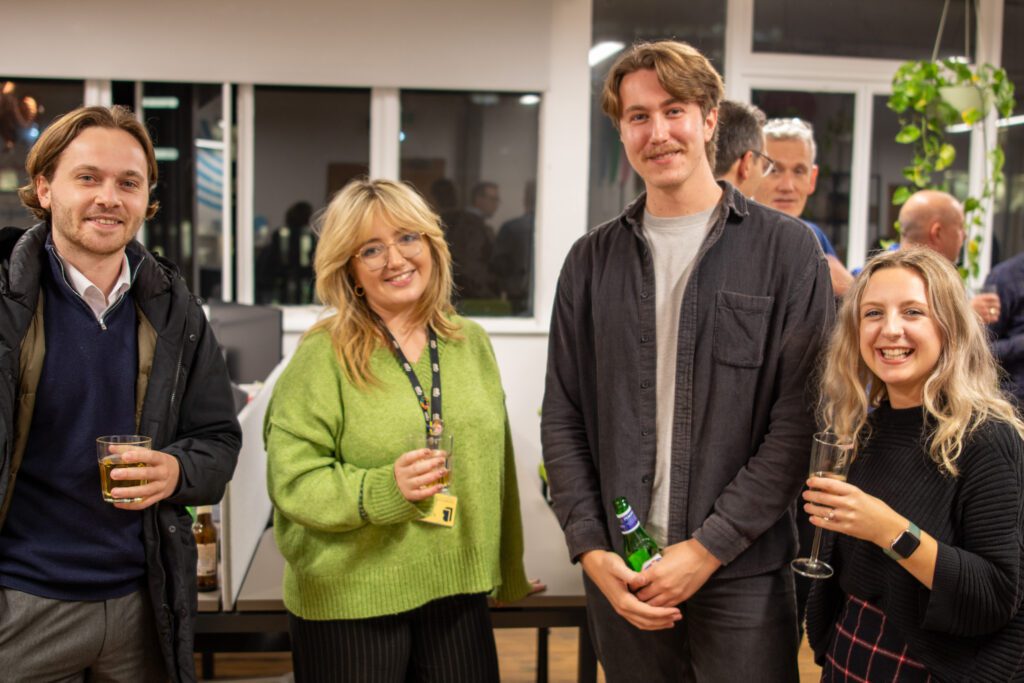
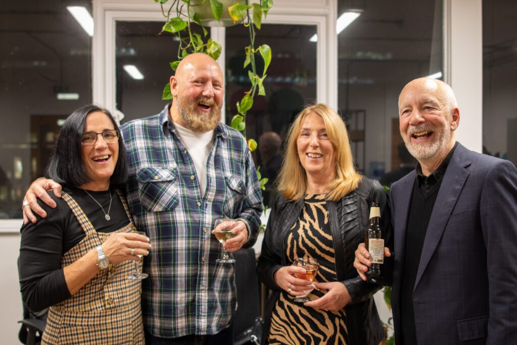
As part of our birthday celebrations we recently held a little party with some of our friends, clients and colleagues! Thank you to everyone that came along and made it such a great evening. It was fantastic to catch up, reminisce and reflect on the last 35 years whilst also looking ahead to the next chapter for us as an agency, and the creative sector as a whole, with the advent of AI and the next technological wave.
Here’s to the next 35 years!
We’ve been in Liverpool for a while, 35 years in fact, so we thought we’d create a suite of illustrations of iconic features of the city (with a birthday twist) and give them away…for FREE!
We’ll be making them available online soon but if you’d like to get a set before then drop us a message or give us a call!
Albert Einstein famously said “Play is the highest form of research” and we couldn’t agree more.
We are a curious and creative bunch here at Kaleidoscope, and we often spend time trying out new ideas, experimenting with technology or having a good old play with something new that we find interesting.
Often these things end up filed at the bottom of a shared drive and forgotten about, but as part of our 35th birthday celebrations we have not only been carving out some more time for the team to explore ideas, learn new skills and generally have a bit of fun doing what they enjoy, but we have decided to create a dedicated space to publish and celebrate these moments of creative play. We call it the Kaleidoscope Playground.
Our first release is a browser-based puzzle game called Colour Flood. Our own take on a colourful ‘flood fill’ game built in JavaScript which can run on any device. It is simple to play, hard to master and we dare you to not get addicted!
As we continue to reflect on our 35 years of business, we’ve been taking a look at the brands that have led the way in this time to see what we can learn from them and identify what enables a brand to transcend time. And there aren’t many bigger brands out there than Nike who remain as influential now as they ever have been, with their ‘Just Do It’ proposition playing a huge role in their success. And it just so happens that ‘Just Do It’ was first used on an ad in 1988 – the year Kaleidoscope was formed! So in this blog we’ve explored the journey of the proposition from its launch 35 years ago to its enduring relevance today.
In 1988, Nike revolutionised the world of advertising and branding with its iconic proposition, “Just Do It.” Since its inception, this powerful slogan has grown from a mere marketing campaign into a global phenomenon that transcends generations. Over the years, Nike’s ‘Just Do It’ proposition has evolved, adapting to changing consumer behaviours, societal norms, and technological advancements. In this blog, we will explore the journey of ‘Just Do It’ from its launch in 1988 to its enduring relevance in 2023.
The Birth of ‘Just Do It’
In the late 1980s, Nike faced stiff competition in the athletic footwear market. To counter this, the company teamed up with advertising agency Wieden+Kennedy, which created the unforgettable ‘Just Do It’ tagline. The phrase encapsulated the essence of the brand: an empowering call to action, urging athletes to push their limits and overcome challenges. Initially launched alongside a simple TV ad featuring an 80 year old runner, and then used on bigger profile, captivating television commercial featuring various athletes, the slogan resonated strongly with consumers, propelling Nike to new heights.
Adapting to Social and Cultural Shifts
As years passed, Nike recognized the importance of staying relevant in an ever-changing world. The brand continuously evolved ‘Just Do It’ to align with contemporary social and cultural narratives. During the 1990s, the slogan took on a more inclusive tone, encouraging individuals from all walks of life to pursue their dreams fearlessly. This shift reflected the growing emphasis on diversity and empowerment, resonating with a broader audience and cementing Nike’s status as a socially conscious brand.
Embracing Technology and Digital Transformation
With the rise of the digital era, Nike embraced technology as a means of connecting with its consumers. ‘Just Do It’ found new life in digital campaigns, engaging users through social media platforms, interactive websites, and personalised content. By leveraging user-generated content and incorporating cutting-edge technologies like augmented reality, Nike strengthened its bond with tech-savvy consumers while keeping the message of determination and perseverance intact.
Partnerships and Collaborations
Another pivotal factor contributing to the longevity of ‘Just Do It’ is Nike’s strategic collaborations with athletes, artists, and influencers. By associating the proposition with notable figures who embody the spirit of pushing boundaries, Nike expanded its reach and influence. These partnerships not only generated buzz but also inspired people worldwide to chase their dreams relentlessly, further reinforcing the message behind ‘Just Do It.’
Addressing Contemporary Issues
As societal concerns such as climate change and mental health gained prominence, Nike adapted its proposition to address these issues. By advocating sustainable practices and supporting mental health initiatives, the brand demonstrated its commitment to making a positive impact on both individuals and the planet. ‘Just Do It’ became not just an encouragement for personal achievements but also a call for collective responsibility and positive change.
The Timeless Essence of ‘Just Do It’ in 2023
Despite over three decades passing since its inception, the ‘Just Do It’ proposition remains just as relevant in 2023. The key to its enduring power lies in its ability to remain authentic and adaptable to the ever-evolving world. Nike has consistently demonstrated its capacity to connect with consumers on a personal and emotional level, making ‘Just Do It’ more than just a slogan but a way of life.
In a fast-paced and uncertain world, where people are constantly bombarded with choices and distractions, ‘Just Do It’ provides a simple yet powerful reminder to take action, face challenges head-on, and pursue greatness. It encourages individuals to step outside their comfort zones, embrace failure as part of the journey, and persist until they achieve their goals.
Nike’s ‘Just Do It’ proposition has evolved and thrived since its inception in 1988, proving its resilience and relevance in 2023. By embracing cultural shifts, leveraging technology, forming meaningful partnerships, and addressing contemporary issues, Nike has kept the proposition fresh and meaningful to each new generation. As long as people continue to seek inspiration, motivation, and empowerment, ‘Just Do It’ will endure as an enduring symbol of determination, self-belief, and the indomitable human spirit.
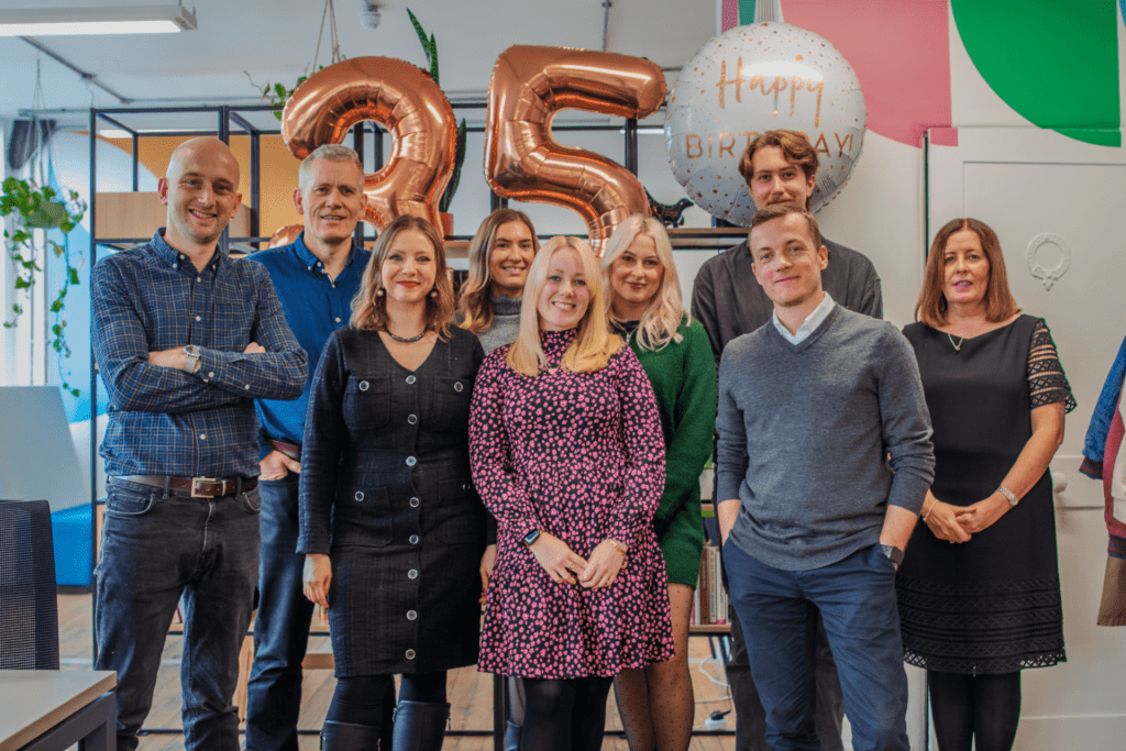
This year marks 35 years of Kaleidoscope!
That’s 35 years of delivering communications that matter for people, organisations and causes across the Liverpool city region and beyond.
And so over the next few months we will be celebrating this milestone for our business through a whole host of ways – telling the stories of the people behind the business in that time, showcasing the work we’ve delivered and the impact we’ve had; in addition to a fun event or two to celebrate with our friends and colleagues who have been part of the journey with us.
But to kick things off we are really proud to launch our ‘Good Turns’ programme which is our commitment to deliver £35,000 of value to our local communities over the next 12 months. We will be delivering this through a whole host of activities that our team can choose and get involved with ranging from volunteering, delivering pro-bono projects, mentoring and financial donations. It is our hope that ‘Good Turns’ will help us deliver even more positive impact for the people of the Liverpool city area, and that it demonstrates our commitment to simply doing the right thing as a member of the local business community.
Keep an eye out for future announcements on what else we’ve got lined up to celebrate our birthday!
Accessibility is a crucial aspect of modern, effective communication. When it comes to creating accessible content, one often overlooked factor is the choice of typeface. Selecting the right typeface can greatly enhance the readability and legibility of your message, ensuring that it reaches a wider audience. In this post, we will explore the key considerations and guidelines for choosing a typeface that promotes accessibility in your communications.
1. Prioritise Readability
The primary goal of an accessible typeface is to ensure readability for all individuals, including those with visual impairments or reading difficulties. Look to opt for typefaces that are clear, well-defined, and easily distinguishable; whilst also seeking to avoid decorative or ornate fonts that may hinder legibility, and instead, choose clean and simple designs.
2. Optimal Character Spacing
Character spacing, also known as kerning, plays a vital role in readability. Ensure that your chosen typeface has appropriate spacing between characters. Tight spacing can make it difficult to differentiate individual letters, while excessive spacing may cause words to lose their coherence. Strike a balance to maintain legibility without compromising aesthetics.
3. Consider Font Size and Weight
Font size and weight significantly impact accessibility. Choose a typeface that offers a range of sizes to accommodate different reading needs. A minimum font size of 12 points is generally recommended for body text, but larger sizes may be necessary for individuals with visual impairments. Additionally, varying font weights can help create visual hierarchy, making it easier for readers to navigate through the content.
4. Contrast and Colour
High contrast between the text and its background is crucial for legibility. Consider using dark text on a light background or vice versa; and try to avoid colour combinations with low contrast, such as light grey on white, as they can be challenging for individuals with visual impairments. Additionally, ensure that colour is not the sole means of conveying information, as colourblind individuals may have difficulty perceiving it. Supplement colour with other visual cues or text descriptions whenever possible.
5. Consider Accessibility Standards
When selecting a typeface, it’s essential to adhere to accessibility standards and guidelines. For digital content, ensure that the typeface is compatible with screen readers and responsive across different devices. Choosing a web-safe font or utilising web fonts through reliable platforms can help ensure consistent accessibility across browsers and devices.
6. Test and Gather Feedback
After finalising your typeface choice, consider whether you can conduct user testing to validate its accessibility. Ask individuals with different visual abilities and reading difficulties to provide feedback on readability and legibility. Incorporate their input and make necessary adjustments to improve the overall accessibility of your communications.
Choosing the right typeface is a crucial step in creating accessible communications. By prioritising readability, optimising character spacing, considering font size and weight, ensuring contrast and colour accessibility, following accessibility standards, and seeking feedback, you can make your content more inclusive and accessible to a diverse audience. Remember, accessible communications not only benefit individuals with disabilities but also contribute to a better user experience for everyone. So, let’s embrace the power of typefaces and create a more inclusive digital world.
A rebrand is an exciting yet challenging project that requires a great deal of bravery. Whether it’s a small update to the logo or a complete overhaul of the brand identity, a rebrand can be a make-or-break moment for an organisation. In this blog, we’ll discuss why bravery is essential in a rebrand and how it can lead to success.
Firstly, rebranding is all about change. It involves stepping outside of the comfort zone and making bold moves to refresh the brand’s identity. This is where bravery comes in, as it takes courage to break away from the familiar and take a leap of faith. But, without change, a brand can become stagnant, and customers and stakeholders may lose interest. Therefore, being brave enough to embrace change is critical to a successful rebrand.
Secondly, rebranding requires authenticity. Consumers are becoming increasingly savvy and can quickly detect inauthenticity. Therefore, it’s essential for brands to be brave and stay true to their values and beliefs when rebranding. Staying true to one’s beliefs can sometimes mean going against the norm. But being authentic is critical in creating a brand that consumers can connect with on an emotional level.
Thirdly, rebranding is all about taking risks. A rebrand is an opportunity to differentiate the brand from its competitors and make it easily identifiable. However, to stand out from the crowd, a brand needs to take risks and push boundaries. This can be unsettling and scary. But, if done right, it can lead to a unique and memorable brand identity that resonates with consumers.
Fourthly, rebranding requires a great deal of communication. The rebranding process involves communicating changes to employees, stakeholders, and customers. It’s essential to communicate the reasons behind the rebrand and the changes being made. Communicating changes can be challenging, and there may be pushback. But, being brave enough to have open and honest communication can lead to a smoother transition and a better understanding of the rebrand.
Lastly, rebranding can be a vulnerable moment for a brand. It involves putting oneself out there and exposing the brand to potential criticism. However, being vulnerable is essential in building trust and creating an emotional connection with consumers. It takes courage to be vulnerable and put oneself out there.
In conclusion, bravery is an essential component of any rebrand. It takes courage to embrace change, stay true to one’s beliefs, take risks, communicate changes, and be vulnerable. However, being brave can lead to a successful rebrand that resonates with consumers, differentiates the brand from its competitors, and builds trust and loyalty. So, if you’re considering a rebrand, remember that bravery is key to success.
Manage Cookie Consent
To provide the best experiences, we use technologies like cookies to store and/or access device information. Consenting to these technologies will allow us to process data such as browsing behavior or unique IDs on this site. Not consenting or withdrawing consent, may adversely affect certain features and functions.
Functional
Always active
The technical storage or access is strictly necessary for the legitimate purpose of enabling the use of a specific service explicitly requested by the subscriber or user, or for the sole purpose of carrying out the transmission of a communication over an electronic communications network.
Preferences
The technical storage or access is necessary for the legitimate purpose of storing preferences that are not requested by the subscriber or user.
Statistics
The technical storage or access that is used exclusively for statistical purposes.The technical storage or access that is used exclusively for anonymous statistical purposes. Without a subpoena, voluntary compliance on the part of your Internet Service Provider, or additional records from a third party, information stored or retrieved for this purpose alone cannot usually be used to identify you.
Marketing
The technical storage or access is required to create user profiles to send advertising, or to track the user on a website or across several websites for similar marketing purposes.